After spending a week along the beaches of the Florida panhandle, I wanted to share with you some beautiful beach inspired color palettes using photos I took from our vacation.
In this post, I’ll also share with you the tools I used to get the color swatches and how I match paint colors with the swatches.
Beach Photo #1
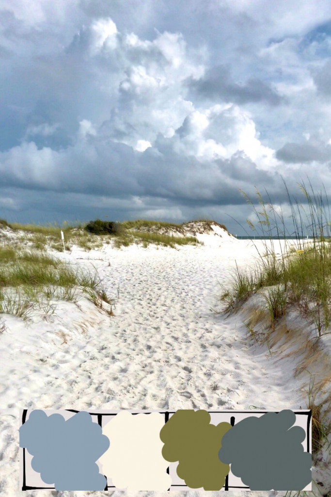
This photo was taken on Shell Island across the bay from Panama City, Florida.
The paint color palettes, from left to right, are:
Behr Basil Chiffonade MQ6-61 or Classic Avocado M340-7
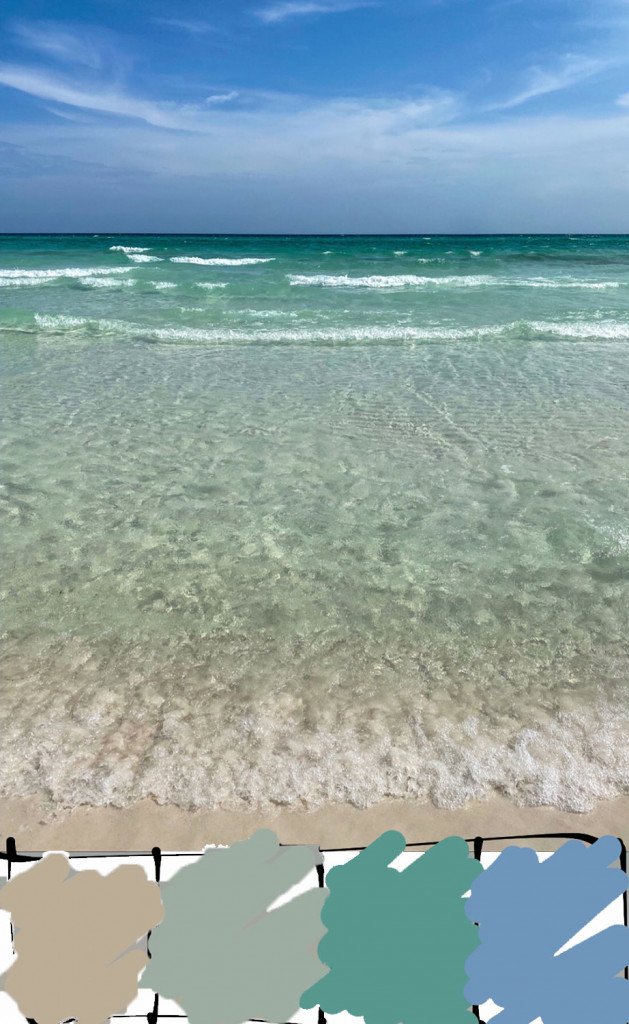
Beach Photo #2
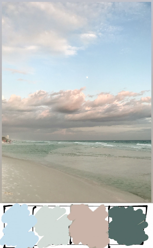
This photo was taken at Santa Rosa Beach in Seaside, Florida.
The paint color palettes, from left to right, are:
Behr Celestial Light MQ3-24 or Seashore Dreams P500-2
Behr Art Deco Pink MQ1-150 or Flowerpot S180-3
Beach Photo #3
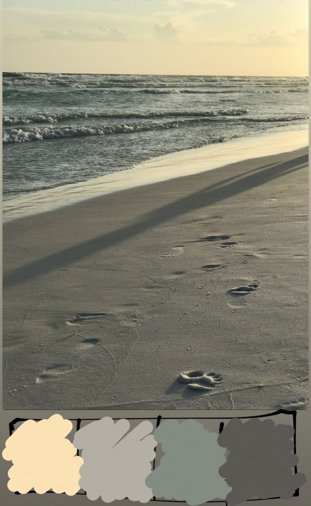
This picture was taken at Santa Rosa Beach in Seaside, Florida.
The paint palettes, left to right, are:
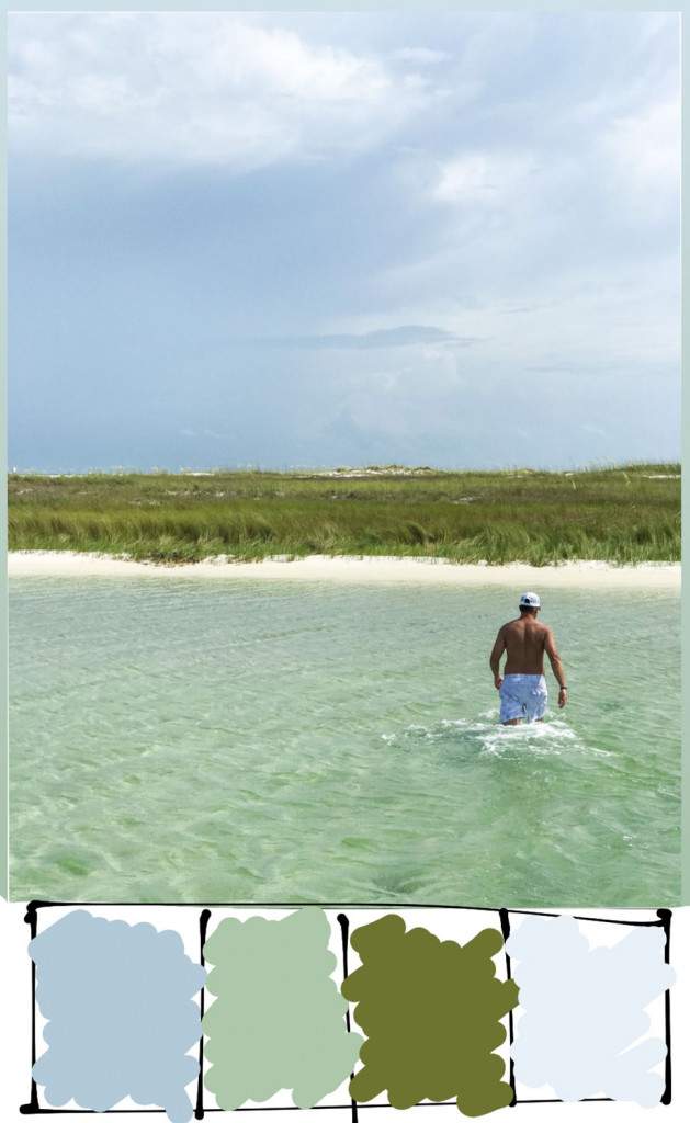
Beach Photo #4
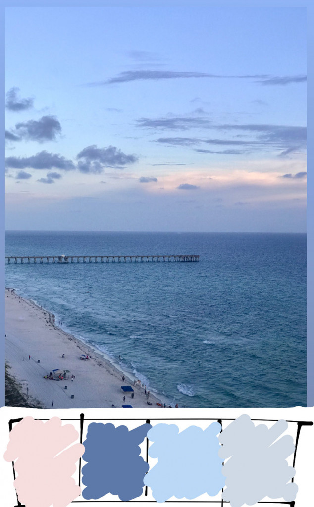
This photo was taken in West Panama City Beach, Florida.
The paint palettes, left to right, are:
Behr Splendor And Pride MQ5-47
Beach Photo #5
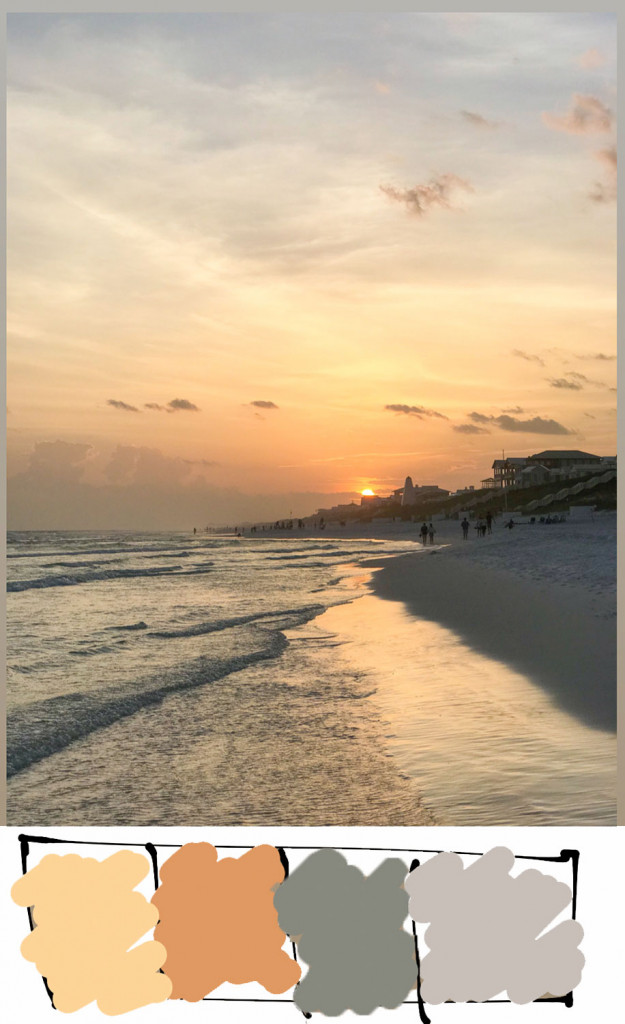
This photo was taken at Santa Rosa Beach in Seaside, Florida.
The paint palettes, left to right, are:
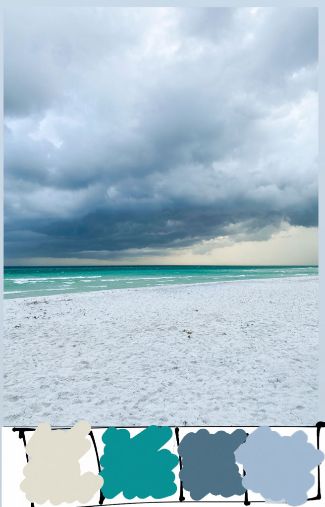
Beach Photo #6
This photo was taken at Santa Rosa Beach, in Seaside, Florida.
The paint palettes, left to right, are:
Behr Aqua Revival HDC-WR15-9 (but make it a bit darker) or Semi-Precious MQ6-06
Beach Photo #7
This photo was taken at Santa Rosa Beach, in Seaside, Florida.
The paint palettes, left to right, are:
Beach Photo #8
This picture was taken at Shell Island across the bay from Panama City, Florida.
The paint color palettes, left to right, are:
Behr French Porcelain P520-2 (but get one shade lighter)
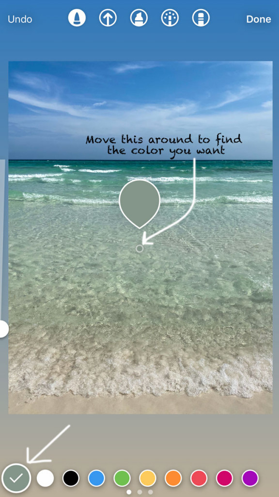
How to Get Color Swatches from a Photo
To first get the color swatches along the bottom, I went onto IG stories, used the dropper tool in the paintbrush option and selected the the area I wanted a color swatch of, then painted it at the bottom. I liked doing this on my phone because it was fast, easy, and after doing this I could save it to my phone without sharing the photo if I wanted. After the photo is saved I can import that photo with the color swatches to any brand’s paint app to get a paint color match.
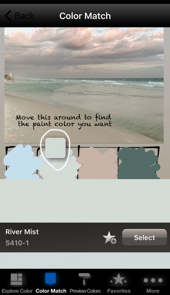
How to Get Paint Colors Palettes from a Photo
Because I have partnered with Behr Paint in the past and I prefer their paint, I used the Behr Color Smart Mobile App (Google or iTunes). In this app I can take ANY photo and find matching paint colors for any spot in the photo.
Look how good of a match that is! Because I already had taken the swatches before, it took me less than a minute to get all 4 paint colors. Sometimes, the paint color suggestion doesn’t quite match, so you can look at similar colors that they suggest below the first one, or select another area of the photo until you find the paint color you are happy with.
Being able to create swatches and paint matches from a photo can be so helpful when designing a room because you can go to Home Depot, grab the paint cards that you need and take them with you when you go shopping for home decor.
I hope you enjoyed this post with beach inspired color palettes and learning how to create color swatches for your next interior design project!
Okay…what a great idea! Brilliant!!! Thank you!
Love knowing this!
Amazing info I got from your blog beach inspire color palettes, Good content! I am just reaching out to say keep up the good work.