Shades of Blue Interiors

  • Home
  • Explore My Home
  • Tutorials
  • About
    • Disclosures
    • Features & Press
    • FAQ
  • What I’m Wearing

A Mustard Antique Buffet

September 8, 2013 Rachel 6 Comments

Well, I’m here 1 minute before midnight, the end to a very busy week. I haven’t been keeping up with my promise completely…. instead of 2-3 posts a week, it has been more like 1 post a week, and kinda last minute. But I really am trying! I’m getting better! And I’m going to start planning my posts, so I have deadlines each week. I’m better with deadlines (even if self-imposed- ha!).

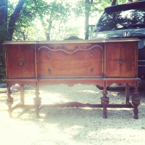
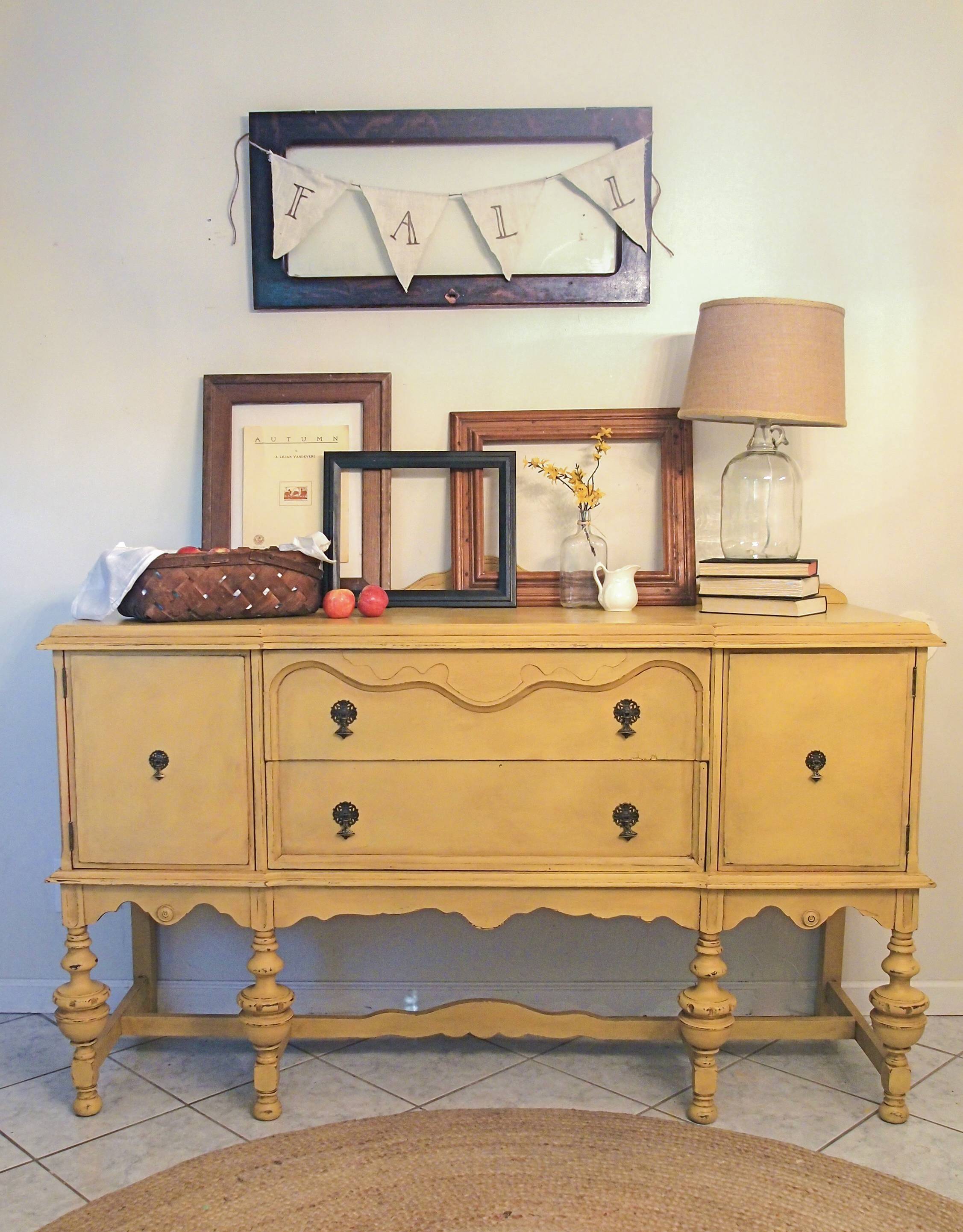
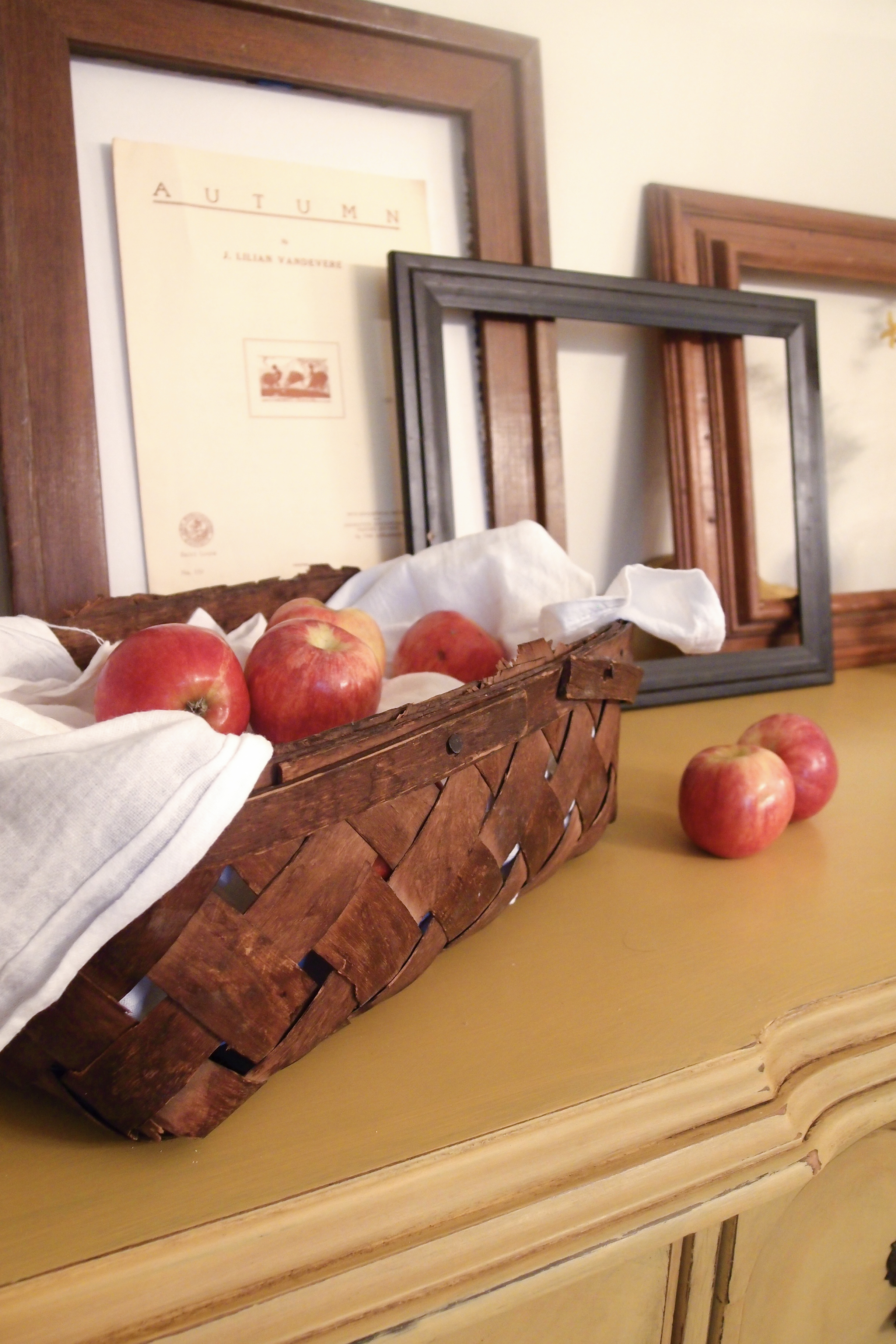
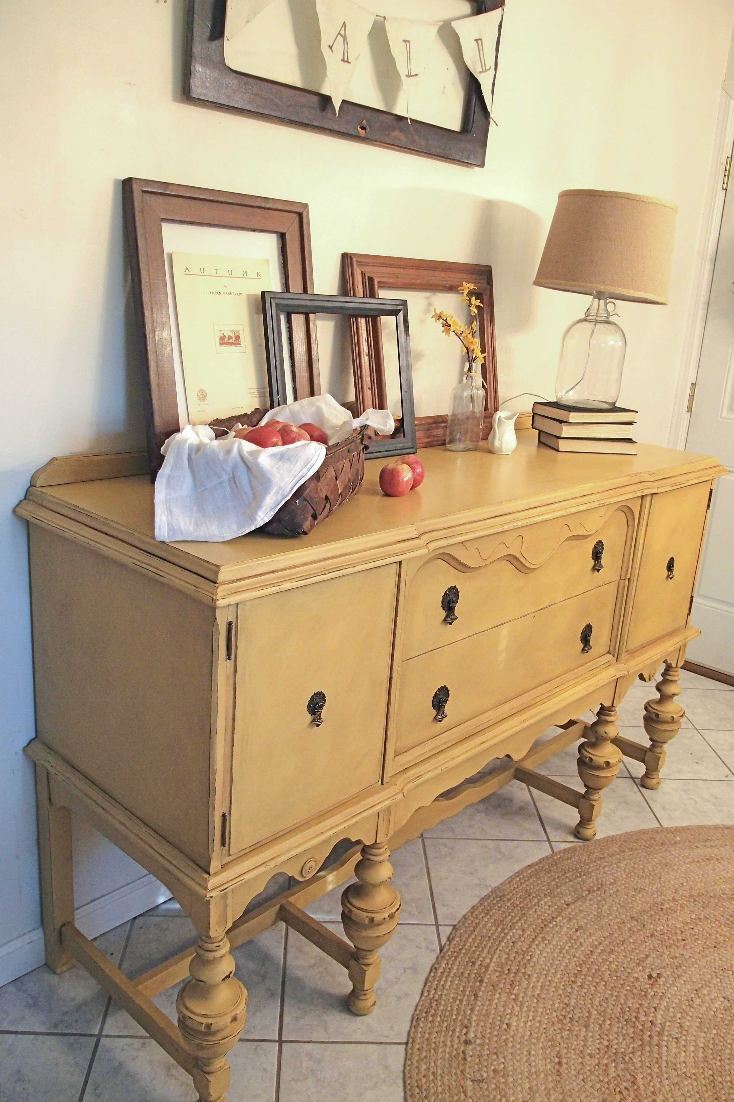
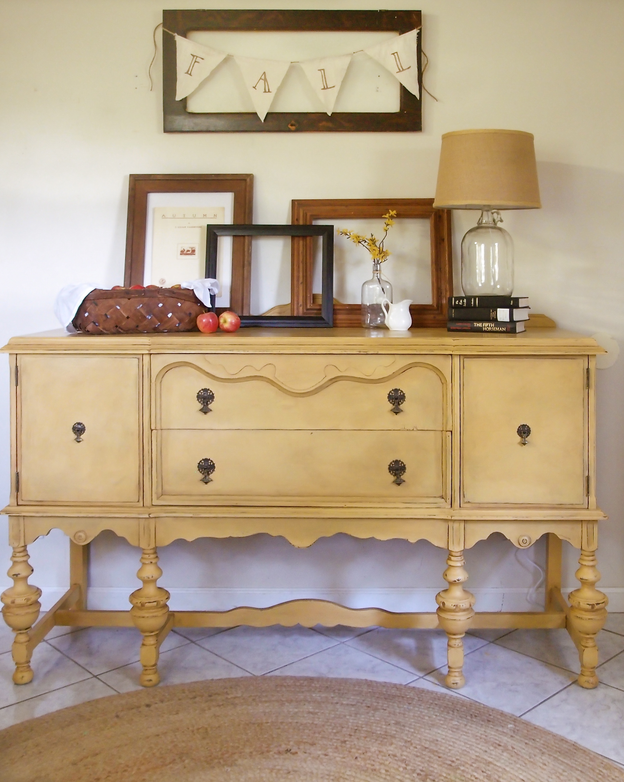
A few weeks ago I picked up this beautiful antique buffet from Craigslist. The guy was moving and had it a long time and assured me on the phone that it looked better in pictures (which I thought was such a funny thing to say!). It did need some work to make it sturdier (glue in joints, screws in some places), but other than that, the drawers were immaculate and nothing major was missing!

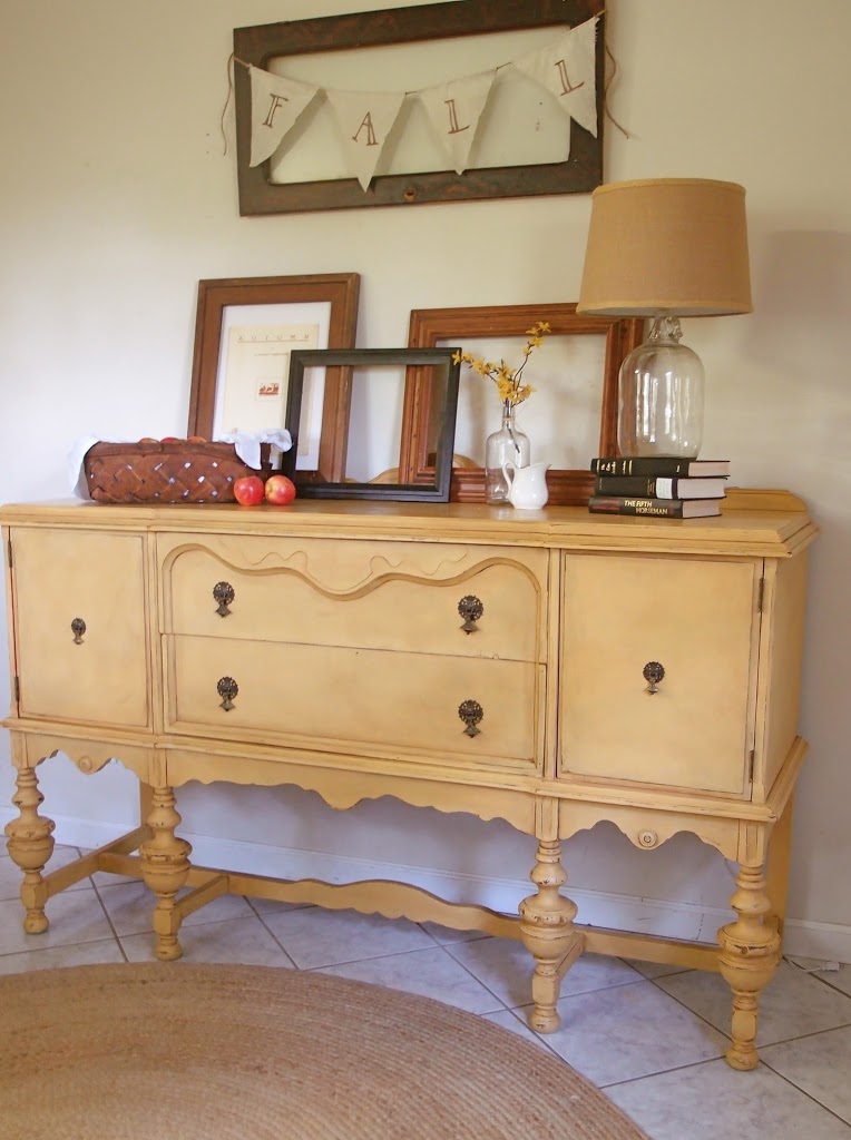
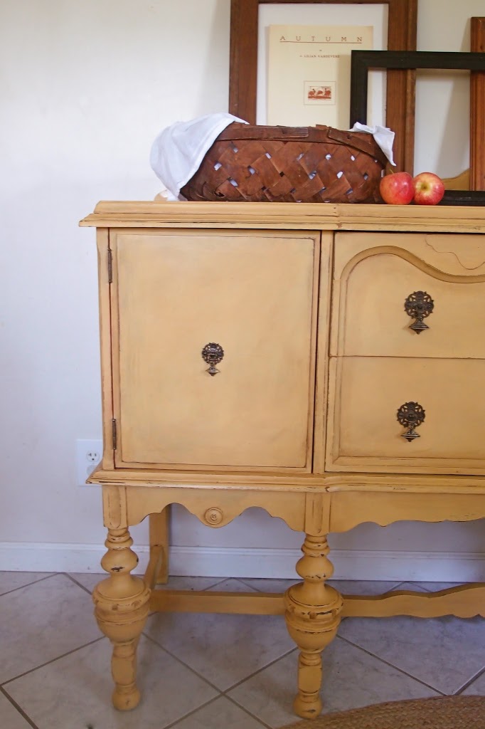
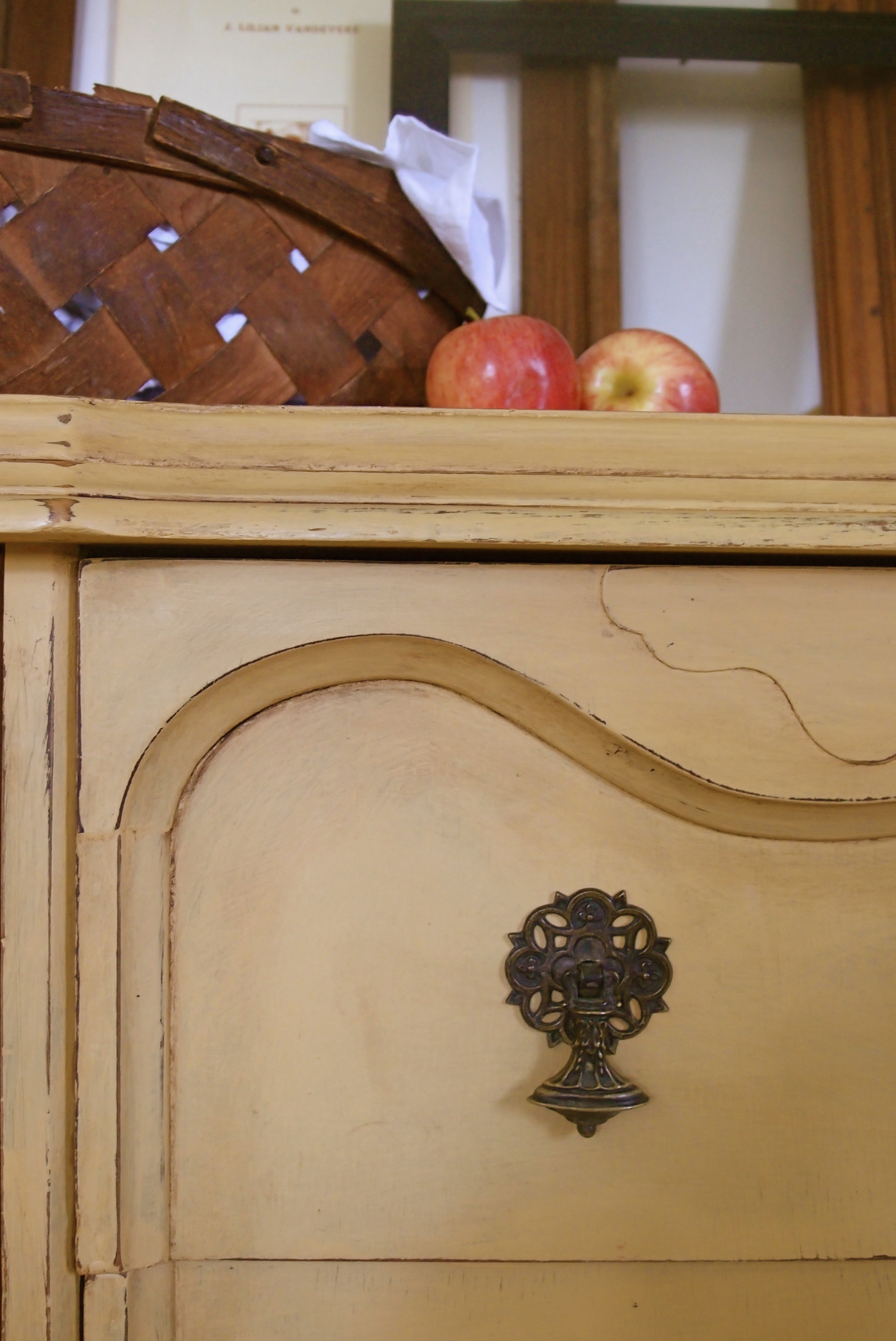
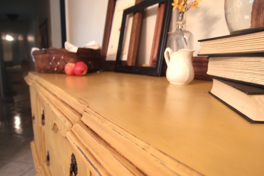
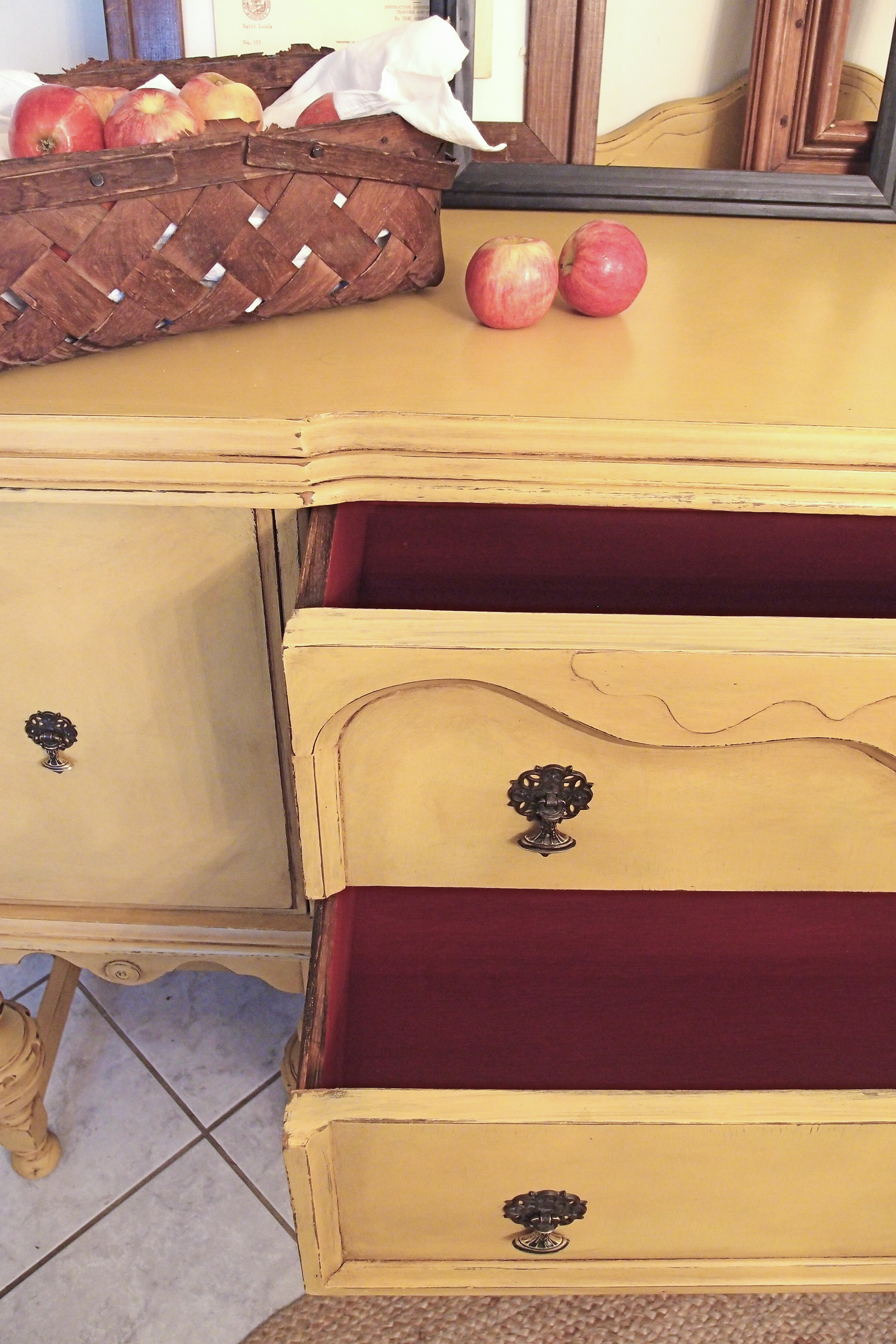
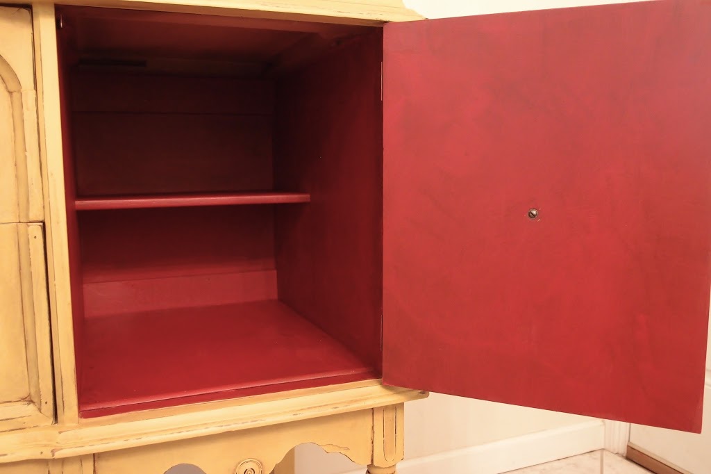
I had been looking for a buffet exactly like this for months for a client. She came to me awhile ago, sent me pictures of her bed and breakfast and described what she wanted. When I saw this, I knew it was right! And she agreed 🙂 It didn’t take long for her to decide on the mustard color of Chalk Paint named, Arles, with the interiors a dark red, which I chose to mean Emperor’s Silk.


I took a few pictures in natural light and a few with the chandelier light on, just so you could see how this shade of yellow look almost like grains of wheat in natural light and then warms up to a shade of mustard with interior lighting.


This is one of the few color of Chalk Paint that doesn’t change or deepen much once clear wax is applied. I used dark wax to bring out the details and moderately distressed all along the edges and the legs.
Isn’t the hardware amazing? I LOVE their patina. This is probably my favorite picture from the whole bunch.

OLYMPUS DIGITAL CAMERA

The fall tablescape I whipped up pretty quickly from things I had lying around. The lamp I made (it is not completely finished yet though!) from a vintage cider jug, the frames I had in my basement, the basket (which I LOVE) was also in my basement from a yard sale, the glass cabinet door frame was from an old, falling apart hutch/cabinet thing that I decided to take apart. I haven’t painted it yet, I may or may not. The “FALL” bunting I whipped up last minute, an inspiration from Danielle over at Finding Silver Pennies’ round-up of Fall Decor. I  used scrap linen fabric, brown acrylic paint and twine. Seriously took me 15 minutes.

OLYMPUS DIGITAL CAMERA

Oh, real quick I wanted to mention the top coat for the top of the buffet! I chose to NOT go with furniture wax. The reason? This buffet is going to see lots of use from all kinds of hot dishes and what-not. Furniture wax isn’t ideal for that kind of use. I wanted something a little more durable for heavier use. I went with Water-Based Polycrylic Topcoat in Satin. I put on 2 coats and also coated in the inside of the drawers and cupboards. I considered going with Verathane for floors (which is what Shaunna at Perfectly Imperfect used to use as a topcoat on painted furniture because it doesn’t yellow), but knowing I wasn’t going to be using a lot and Verathane only comes in the gallon size, I decided to find a good alternative.


I was so pleased to find some sheet music in my stash that coordinated with my theme to put in one of the frames! haha!

OLYMPUS DIGITAL CAMERA

A closer look at the bunting!

OLYMPUS DIGITAL CAMERA

OLYMPUS DIGITAL CAMERA

Interiors…

OLYMPUS DIGITAL CAMERA


Okay, I’m done with interior lighting. Back to natural light.

OLYMPUS DIGITAL CAMERA

Ahhhhh…..MUCH better!


Gallery

Comments

  1. Helen says

    September 8, 2013 at 8:45 am

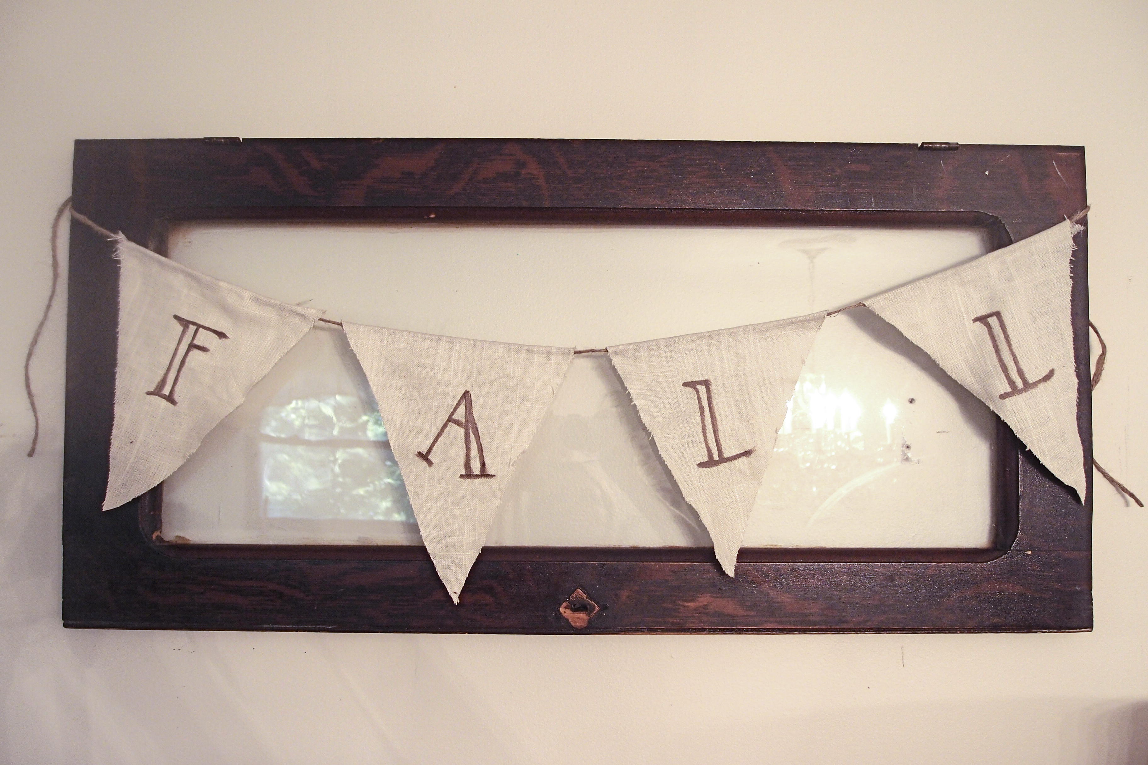
    Rachel, it looks so pretty!! Cute bunting too….last minute projects are the best : )

    Reply
  2. Stephanie@New Again says

    September 8, 2013 at 12:21 pm

    Looks beautiful!! Love the colors. 🙂

    Reply
  3. Leia says

    September 8, 2013 at 2:42 pm

    So pretty! I love this yellow color, I think some things in my house need to be that color. Great job!

    Reply
  4. Patti-Ann says

    September 8, 2013 at 5:26 pm

    It is lovely and true to color for a computer image. What type of camera do you use?

    Your work is great and I think you might require an awful lot of yourself in the posting/staging arena. I am guessing some of the time it took might have gone into one or two more written posts for someone else. Just a thought. Ease up on yourself 🙂

    Reply
  5. Danielle says

    September 13, 2013 at 10:18 pm

    This is beautiful! I love the color you chose for this and the red inside is perfect. Lovely! Thanks for sharing at Silver Pennies Sundays. x

    Reply
  6. Beth@Makemeprettyagain says

    September 14, 2013 at 2:20 am

    So pretty!! I love the red contrast w/the Arles. So nice to see these buffets done in different colors. Nice job!

    Reply

Leave a Reply Cancel reply

Your email address will not be published. Required fields are marked *

Recipe Rating


This site uses Akismet to reduce spam. Learn how your comment data is processed.

Hi! I’m Rachel.

Subscribe

Privacy Policy & Disclosures

Category

[footer_backtotop text="Top"]
Copyright © 2023 Shades of Blue Interiors · Customization By: Creative Kristi Designs