Today I’m sharing a fun refresh I did in my front room and entry! I added floor-to-ceiling wall moulding, wallpaper, fresh paint on walls and furniture, and some new lighting and decor, giving this room a more classic and traditional vibe.
This room refresh is part of the #BEHRBox Challenge sponsored by the BEHR Paint Company. All thoughts and opinions are my own. I have loved and used BEHR Paint for years, so I was very excited about this opportunity! Do you remember the last BEHR Paint challenge I did? It was my front porch makeover 2 years ago and while it was a lot of work, it has been one of my favorite projects to date! Check it out here.
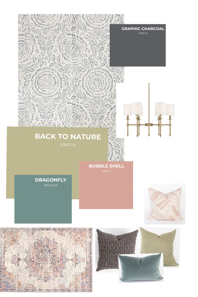
This time, I was sent a mystery box of items to incorporate, including BEHR®’s 2020 Color Trends and Color of the Year: Back by Nature S340-4.
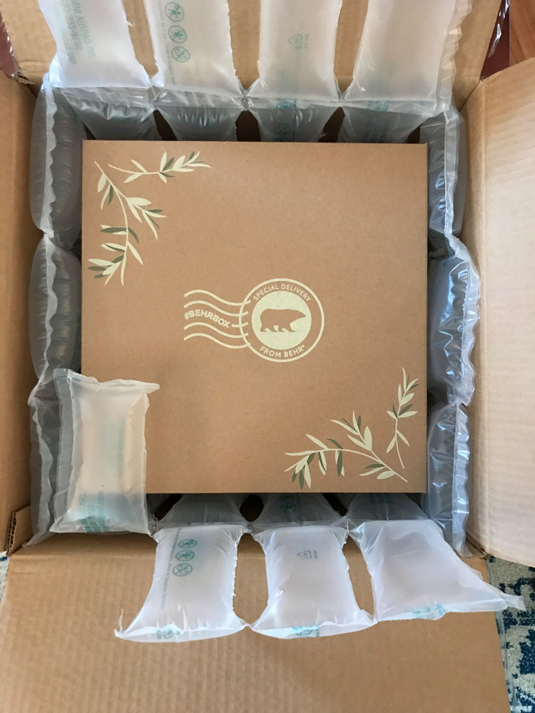
The tricky part about this challenge was that we couldn’t get started on the project until our box arrived and we would only have 1 week to complete everything! That is a VERY tight timeline when you have a 5 month old EBF baby! Thank goodness for a supportive husband who was able to take some time off and help me for a couple days.
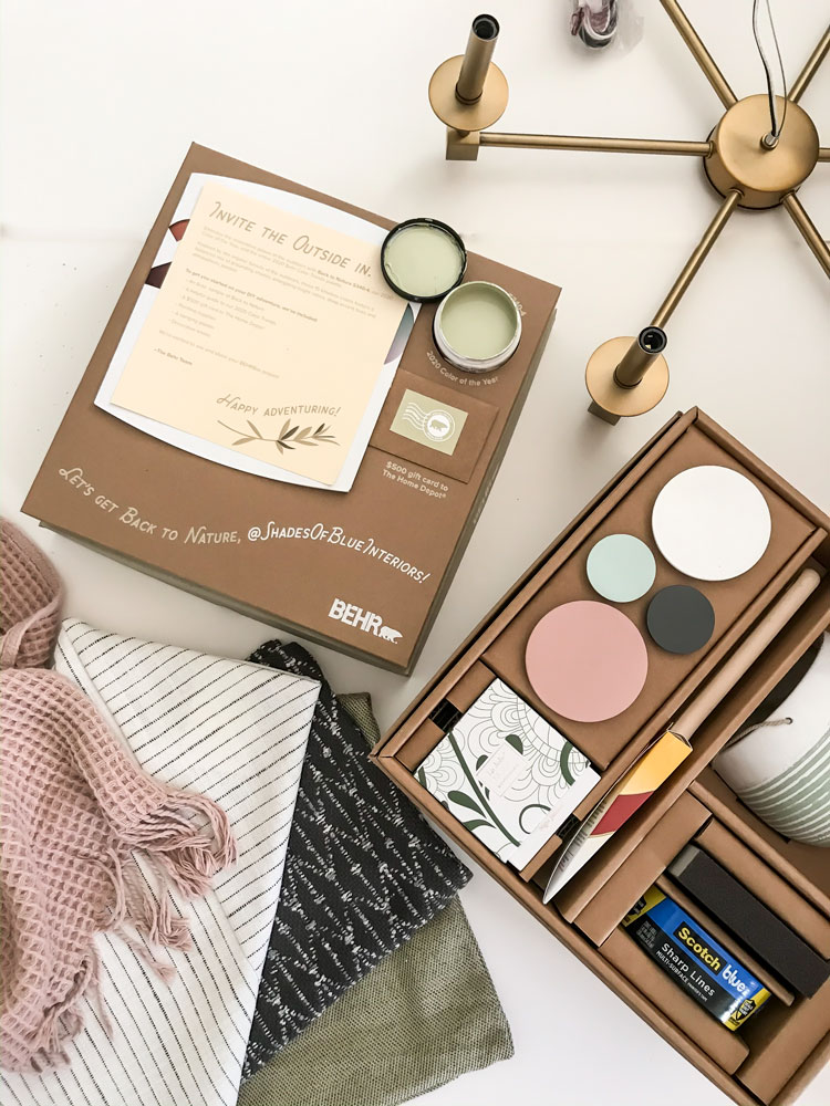
Of course I knew about the upcoming challenge a month or so before, and while I didn’t know the exact contents of the box, I knew immediately I would be tackling my front room and entry.
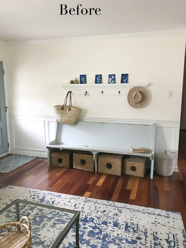
For years this room hasn’t quite felt “finished”, and while the “before” wasn’t bad at all, I had been brainstorming for months about adding additional moulding around the room (previously it was just on the piano wall) and new lighting. The rest of the details came together after I saw the color palette I would be using.
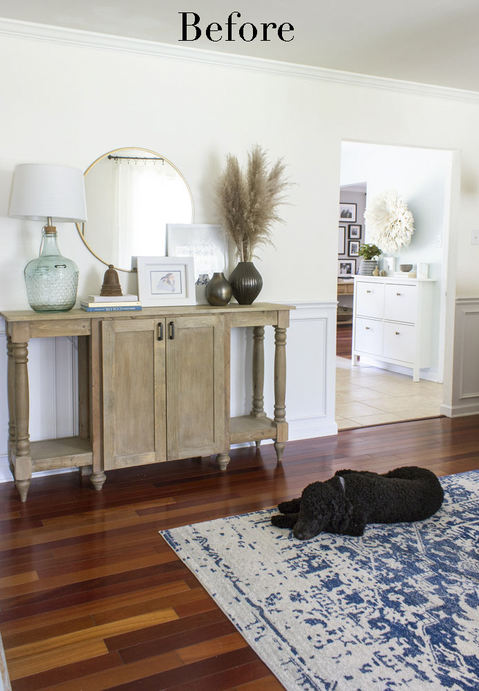
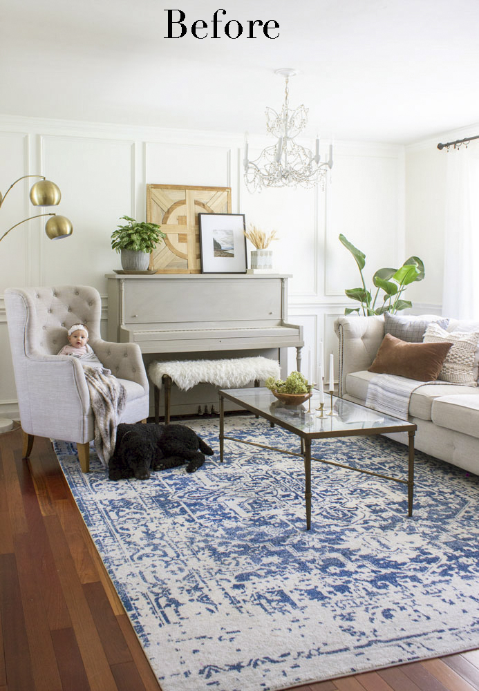
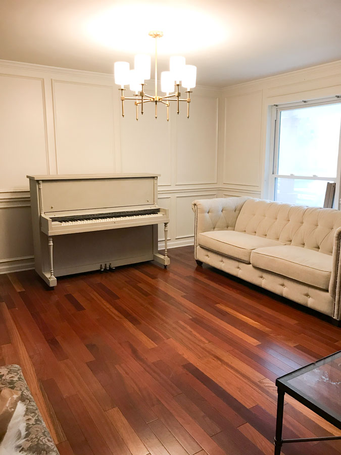
As I said, I’m not mad about this “before” at all. But, it was feeling a bit bland with the creamy white walls, gray piano, gray chair, cream sofa, chandelier that blends in… I was fighting to bring life in through the rug and plants.
Once I created a mood board for the space, I could see it all finished and I got excited!
I made a video I made of the whole #BEHRBox Challenge experience, check it out below!
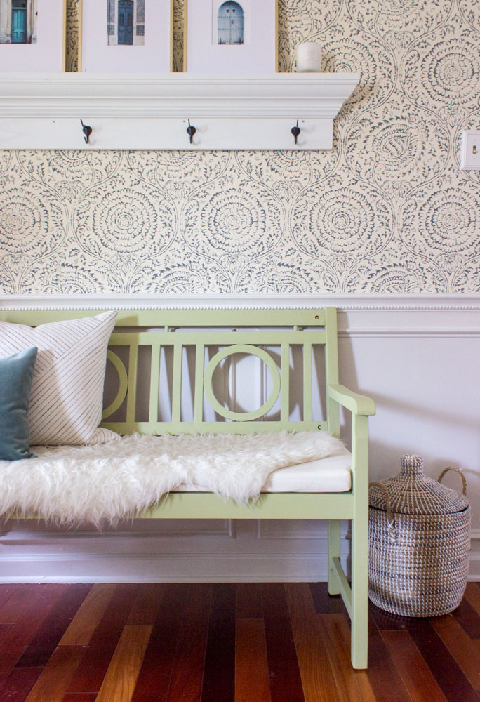
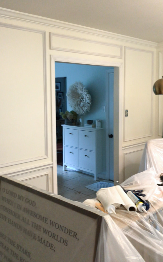
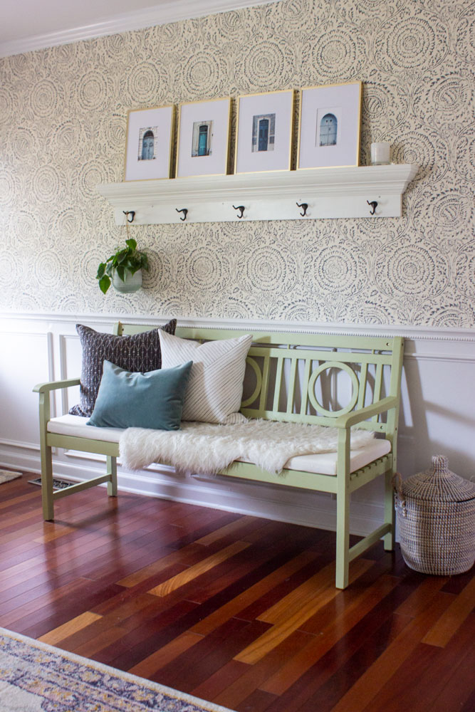
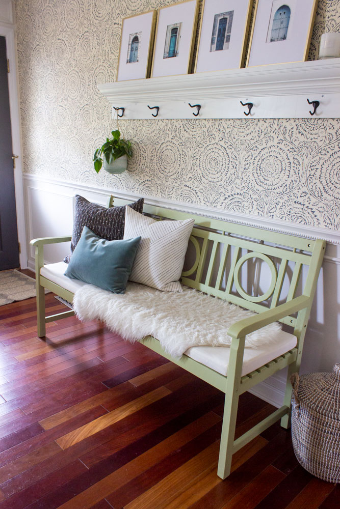
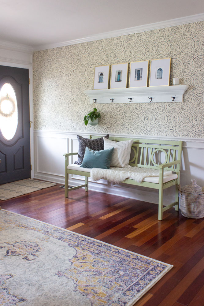
The only thing I did before I got the mystery #BEHRBox was the wallpaper in the entry. In the interest of time, I chose to order and apply the wallpaper about a month ago. This also allowed me some time to figure out if I could make this church pew bench still work here.
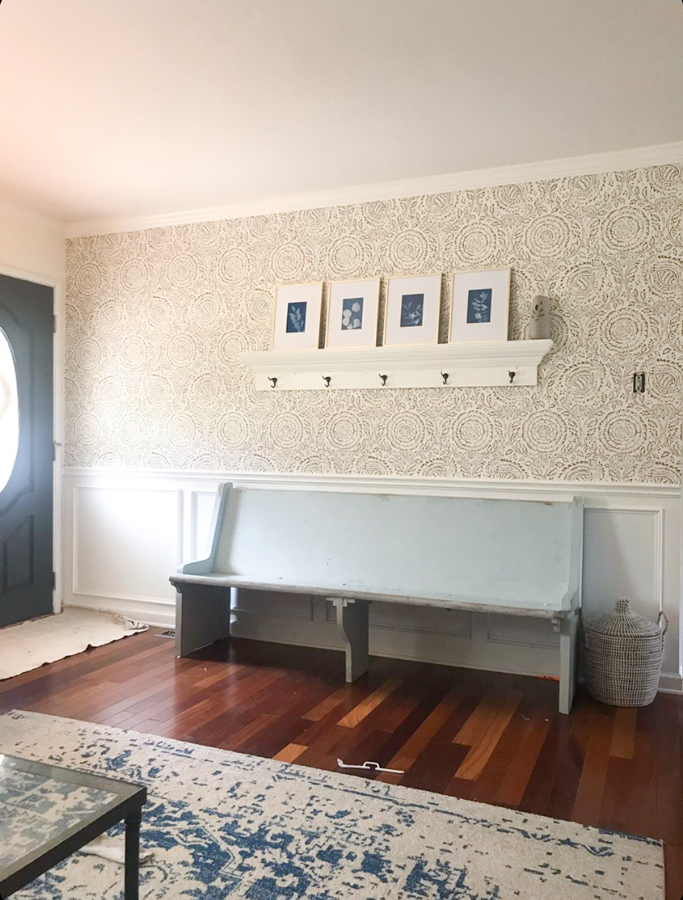
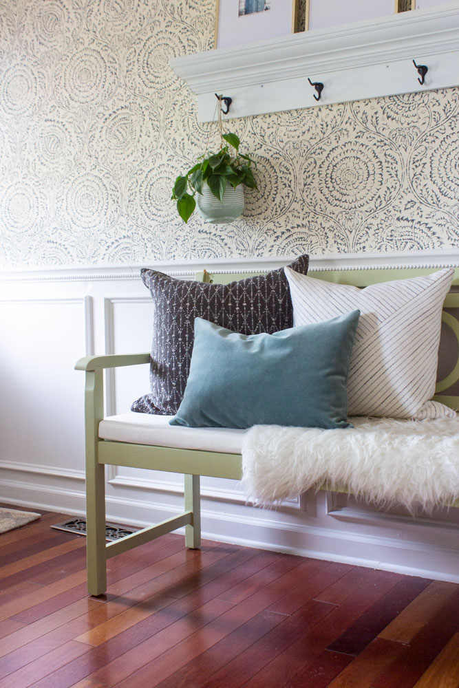
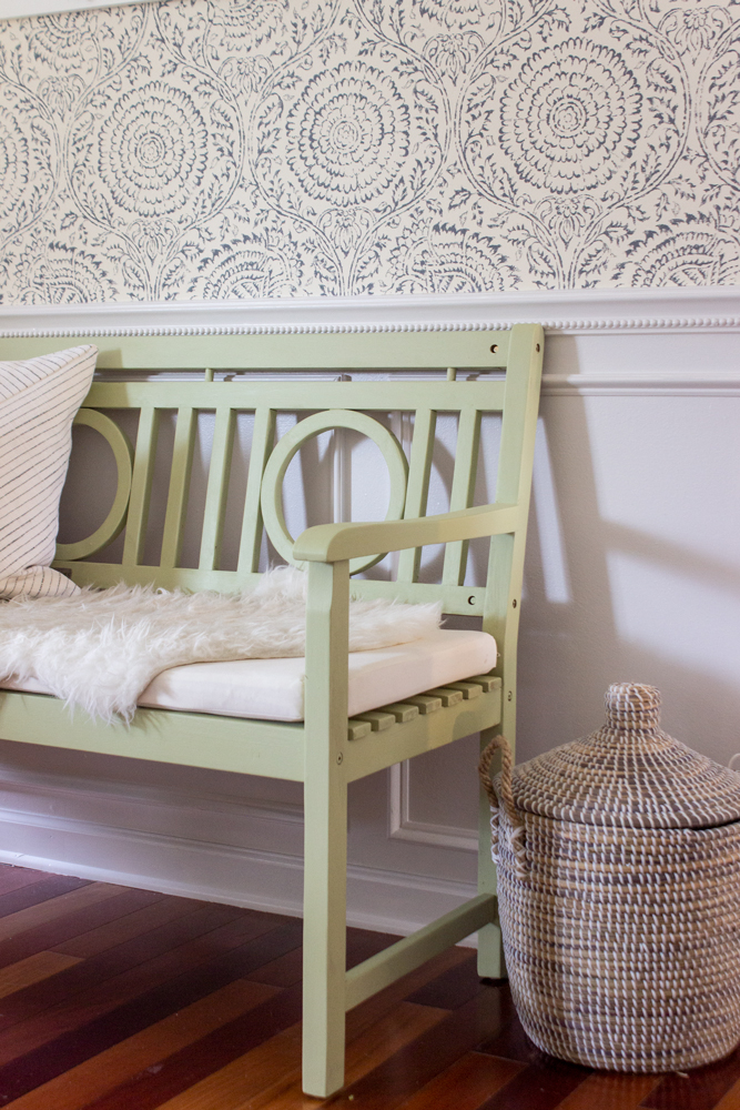
I decided it was more “farmhouse” and less “traditional” than I wanted. So, I swapped it out with a bench I already owned that was on our front porch, and started painting it with the BEHR 2020 Color of the Year, Back to Nature S340-4. It is a light green that is so pretty and versatile with other nature-inspired colors, which is a welcome change to the light blue I had on the other bench for several years. I used used BEHR MARQUEE® Interior Paint in a matte finish.

Then, I started tackling the wall moulding. This is a big project and while it isn’t difficult per se, you DO have to be very careful and precise with your measurements and miter cuts.
Shortly after I took this pic, I realized that on that wall to the left of the walk-way I hadn’t lined up one of the rectangular panels with the lower panel quite perfectly, which meant the spacing between was off (which I didn’t discover until I was about to apply the third panel). So I had to remove 2 rectangular panels (8 pieces of trim that had already been cut, nailed, glued, wood-puttied, and caulked.
I’m not going to lie– I cried. It felt like a punch in the gut with 3-4 hours of work down the drain. Which may not sound like much, but with the tight timeline (I only had Bruno’s help for 2 days), juggling a baby, a dog who kept jumping the fence, and 3 big kids with soccer practice and homework, it was a big setback. Not only that, but when I removed a couple of the trim pieces that had liquid nails on the back, it removed some pieces of the wall with it! So I had to apply spackle, let it dry, and sand before putting the trim back on.
With the drama and tears behind me, we managed to finish the wall moulding by lunch on Friday, then spent the afternoon and evening painting. By 11pm walls, trim, and ceiling were done. We used Painter’s White PPU180-08 on the walls with BEHR MARQUEE Interior Paint semi-gloss, and ULTRA PURE WHITE® PPU18-06 in semi-gloss on the crown moulding, baseboards, and window/door trim.
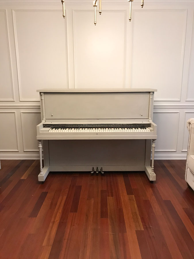
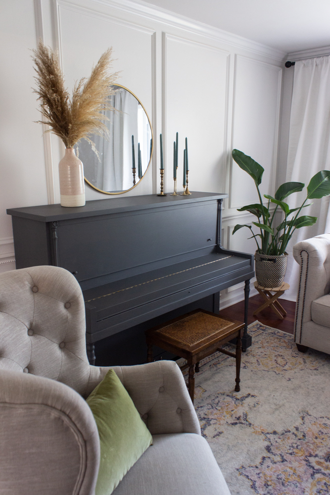
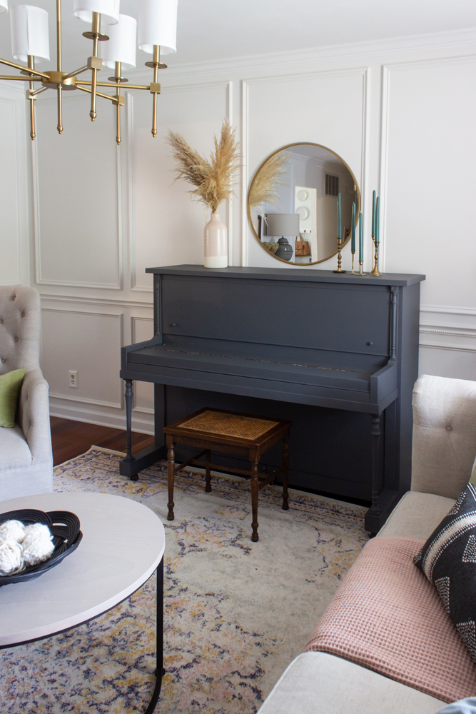
Now it was time to tackle the piano.
I painted this piano a few years ago with chalk paint and it held up okay with no top-coat. I had to do some touch-ups now and again, but more than anything I was ready for a bolder color.
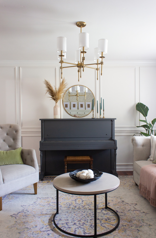
I chose Graphic Charcoal N500-6 and used BEHR MARQUEE Interior Paint. I also painted the inside of my front door with Graphic Charcoal but in a semi-gloss finish, which is a bit more durable than the matte finish.
Now for the big reveal…
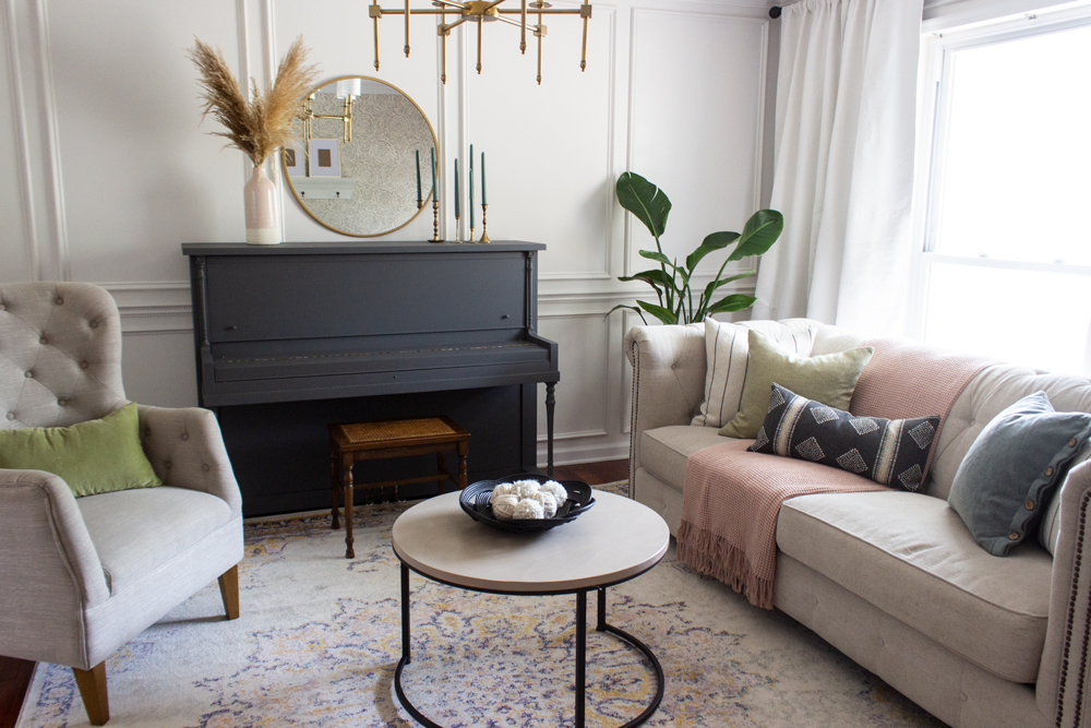
What a change right? This space looks anything but bland now!
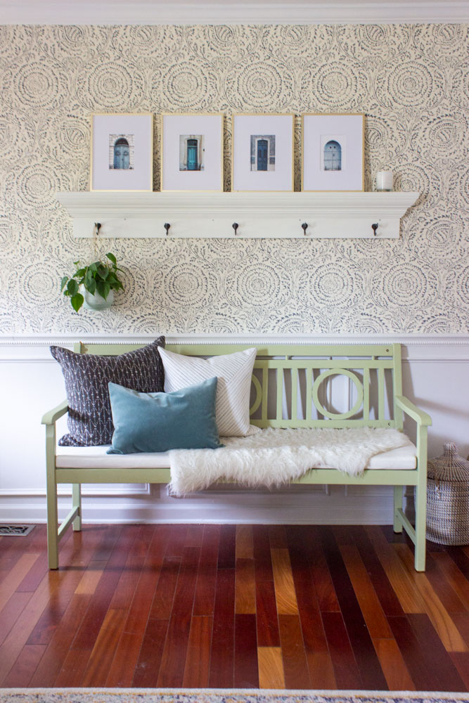
I love the color of the new bench and the style/size is so much different than what was here before. It is a welcome change!
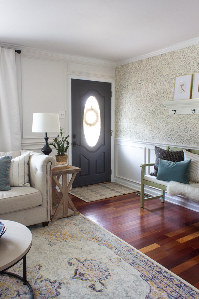
The darker front door color is so much more bold than the robin’s egg blue we had here before, and I love how it looks with the wallpaper! Graphic Charcoal is truly a gray, but it definitely has some blue undertones because in different lights it looks navy.

The piano now makes a huge statement against the pretty wall moulding. It inspired me to go simpler with the decor items and really let the classic silhouettes of the furniture stand out.
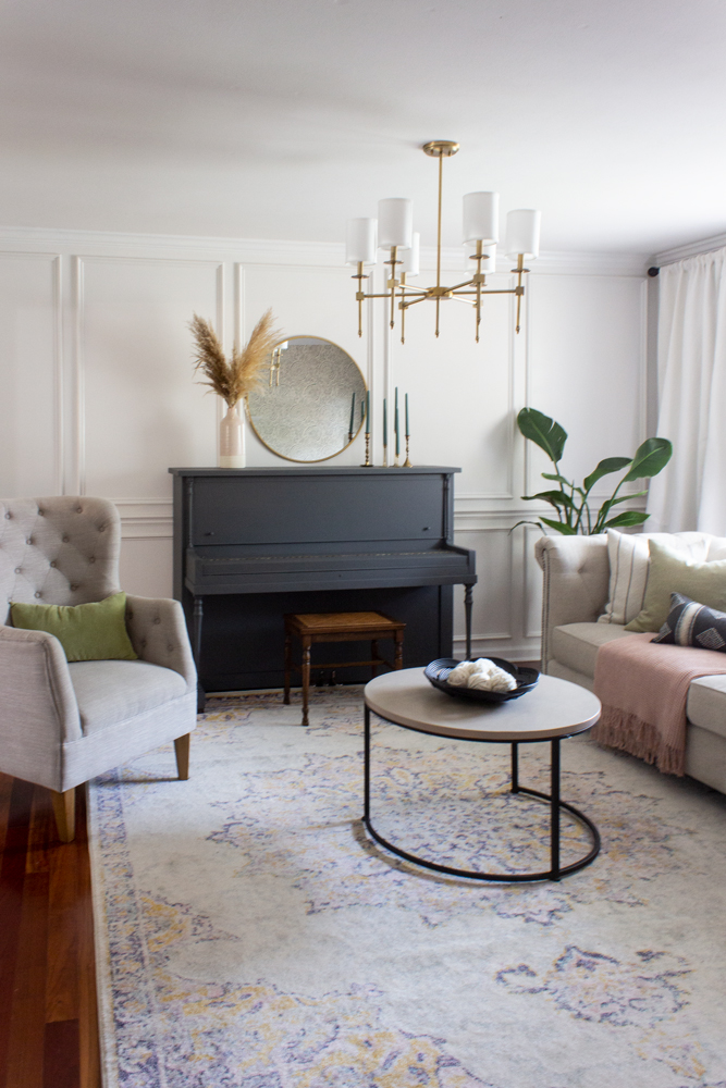
I was able to hit up St Louis Vintage Market Days last weekend and buy a new piano bench, which was perfect for this space. I think every room needs at least a few things that are vintage and that little cane-topped bench is unconventional and the perfect size!
I used many items that I already owned, but I did get a new rug, a few new pillows, new curtains (and hung them wider), new coffee table, and lighting.
This view is so much different now than before. The creamy yellow color was too yellow before, and the walkway didn’t have any trim. Now it looks elegant and classic!

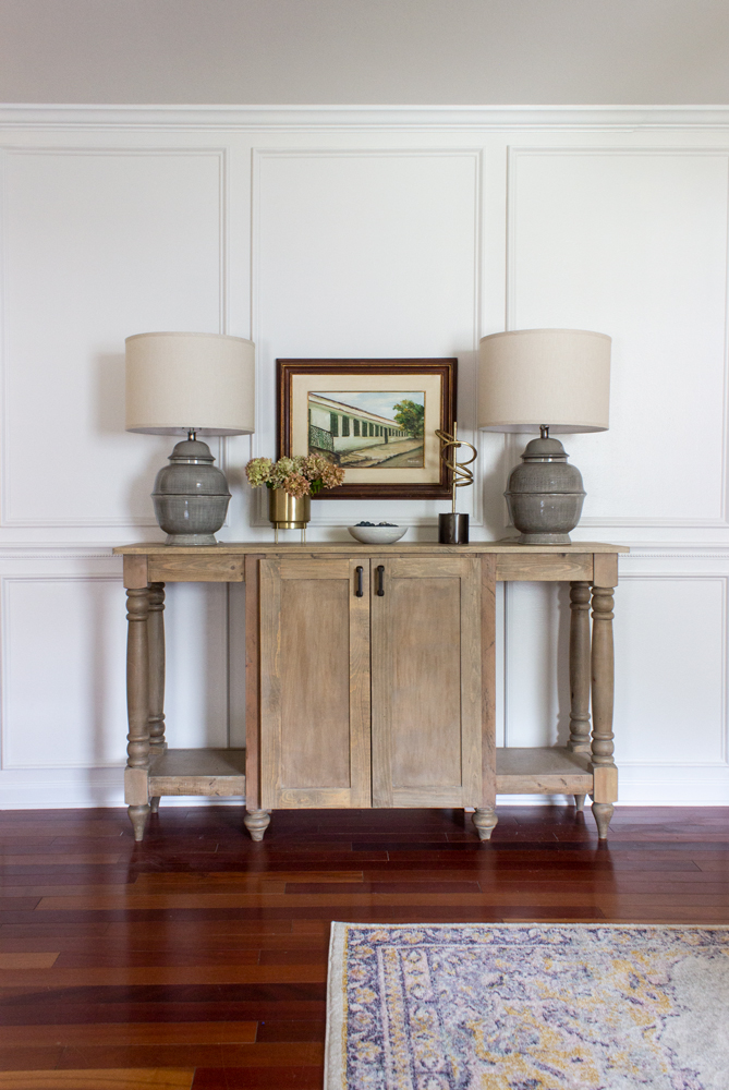
The buffet I made years ago even looks better now, especially with those beautiful lamps I scored at HomeGoods!
The painting between the lamps is actually from Brazil and we brought it back from our visit there 2 years ago. You see, it belonged to Bruno’s late grandmother and is a painting of his great great grandparents in Vassouras, Rio de Janeiro, on the farm they used to own. It was perfect for the space because it has some of the same green tones I have in the room!
I love how this room came together and it feels like it was always meant to be like this!
A huge thank you to BEHR for inviting me to participate in the #BEHRBox Challenge and giving me the opportunity to make this space my new favorite in our home!
What do you think? What is your favorite part?
Sources (affiliate links used):
Wall paint color: Painter’s White PPU180-08 BEHR MARQUEE Interior Paint in a semi-gloss finish
Crown moulding, baseboard, door trim paint color: ULTRA PURE WHITE® PPU18-06 in a semi-gloss finish
Piano paint color: Graphic Charcoal N500-6 BEHR MARQUEE Interior Paint in a matte finish
Entry bench paint color: Back to Nature S340-4 BEHR MARQUEE® Interior Paint in a matte finish
Front door paint color: Graphic Charcoal N500-6 BEHR MARQUEE Interior Paint in a semi-gloss finish
Pillow on entry bench: Gray Pattern, White with Stripes, Blue Velvet Lumbar
Pillows on sofa: White with Black Stripes, Light Green, Black Lumbar
Coffee table (similar here and here)
Chair (similar here)
Green Lumbar Pillow on chair: old World Market
Pink vase: old Target
Lamps – HomeGoods, same here
really love the update and I love traditional with a modern twist. You accomplished a lot in a short time.
COMPLETE
DESIGN ISSHARP LOOKIN. TY.
Lindo!! Amei!!😍
Like your update!
I enjoyed it out standing job
Wow! What a transformation!! It wasn’t bad before like you said but sure those look much more complete! Love it!!!!
Love the color combos, and that you left some furniture the natural wood.
What a lovely room! I’m not a big fan of wallpaper, but this one is stunning. The bench is much better for the space and the unexpected color adds some playfulness. Nicely done!
I found it very interesting that you used a semi gloss on the walls. I recently painted a living room in flat BERH Chic Gray and it seemed to suck the light out of the room. I’m going to repaint to it in a semi gloss.
Congrats on completing that project so quickly with a new baby! It took me years to accomplish anything after I had kids!
It looks great and looks very polished now.
Love how this looks
It really did make a differents after every thing was changed . Just Beautiful.
Love the colors and how it changed the feel of the room. Nice to see it done and it gives me a better idea of doing color outside my comfort zone! More please! 💕
I love the combination of colors and the new look.
I really liked all 3 of these transformation . Good job in all of them. So pretty. Look the pain colors. I re-did the paint in my house last winter. Looking for new color to pain my kitchen walls. Thanks for all the ideas
love the rooms look more open and inviting now
I really love how you brought everything together. It all looks amazing.
I love how light and natural the rooms look. Beauly put together. So Pretty !
Semi gloss paint is best. And it’s washable. Definitely brightens the room
Nice quiet surroundings
Blue is our Color!! I love the touches of blue Everywhere! Not overwhelming at all! Great job!
I love this space and reusing items with a coat of paint is pure genius.
Looks amazing!
Instead of the piano being “odd man out”
It becomes an inviting piece to the living space.
Love your re-do. What I can imagine that you could do for my house.
This by far was my favorite. The transformation was phenomenal.
I am so excited to start some projects, now that the weather has turned colder,let the painting begin! With behr paint of course!
Beautiful
Love it. So fresh and soothing.
I love the color combinations and the decorating! I guess I need advice from an interior designer because my house looks so “grandma” just like me. 😂
I like the colors, they all work so well together and it’s so clean looking, and it just has a calming effect, GREAT job on the colors. have a GREAT day.
Lots of layered elements make this project SO stunning! Very creative with lovely and functional results!
Perfect colors in a creative fashion. Great job.
Such a beautiful and relaxing color scheme! I love it! It looks so clean and inviting!
looks good with the lighter colors which makes any room look larger.
Beautiful! What a great job! You should be proud of yourself!!
Rachel…..I approve …fabulous job everything flows together. It shows you place a lot of time, love and passion and it will be appreciated for years to come…👍😋🌹
I love the colors. What a bold idea, floor to ceiling molding. It looks fantastic. I love BEHR paint. I am a convert from Benjamin Moore. BEHR has the rich colors combined with durability and price.
We lived in military housing for years, so I got used to white walls everywhere. I am surprised at how much I like the transformation from white. We bought a house last month with beige walls throughout. I wanted to paint it all white to make it fresh and bright; however, after seeing this, I am going to add some color. Your room is beautiful, bright, and homey.
Love the color combo’s, wallpaper and the simplicity of the makeover. You’re very talented and did a fine job with this challenge!
Awesome use of form and color. I have used Behr indoor and outside.
I don’t see much blue but like the room. Feels more cozy than before.
Always enjoy the bench look with pillows and new wall refresh
The before was very plain. The after very sharp and pizzazz. Love the bench color and wall color.
Your ideas are inspirational! Love the finished look.
Lovely , I have used Behr indoor and outside.
It all looks great!
The blues are not overly abundant. The blue has soothing low key under tones giving a added feeling of peace, warmth and coziness.
Beautiful and what warm and relaxing space that you have created.
The colors are beautiful. Not overpowered with blue. The piano and bench are great.
Looks very fresh!
Fresh looking. Nice clean look. Love this.
Nice
Love!!!!
The piano is the only part of the paint updates that still appears not quite finished. It looks dull and flat.
Hi Dee! I didn’t want the piano to be shiny. I know that might look unfinished to you, but I chose a matte finish to contrast (with sheen) the semi-gloss on the walls.
WOW‼️‼️‼️ I Love it all
Awesome!!!
love the colors and wall décor vary inviting !!!