You know when you get a bit weary of switching out pillows for every season because your storage closets just can’t take one more down insert? Just me? haha! As a blogger I feel the pressure to keep things new and different with every season. There is a certain amount of that, that is part of the job, as I am expected to (but honestly enjoy) provide fresh inspiration throughout the year. However, lately I’ve been trying to be more careful with my buying choices. Choosing timeless and versatile pieces that can be moved around the house and fit in at any time of the year. It’s been months in the making, and today I’m excited to share with you how to add timeless color and texture to a room.
My main area of focus was the living room where we probably spend the majority of our time together, as a family. There are often differing opinions from designers and decorators on where to splurge and where to save when putting together a room. In my opinion one of the few items in a room that are worth a splurge, is art.
(Affiliate links used in this post. To see my disclosure policy go here.)

The rest of the room should include quality textiles (throws and pillows), DIY projects, thrifted finds, and some inexpensive decor staples.
Start with the Art
A large piece of art, whether it has subtle and soft colors, or bold hues, can be a statement for a room and set the tone. Choose something that has timeless colors that you love. Think about the colors that you gravitate towards and keep finding a way to incorporate time and time again.
Then pick some art that you connect with, either because it reminds you of something personal, or because of the way it makes you feel. A single space should have no more than 1 very large scale piece of wall art. Exceptions to this are several medium pieces of art grouped together, a diptych, or a triptych that are cohesive and feel like 1. This simply is because it gives the art you have selected and invested in, it’s deserved attention. However, including smaller framed art, sculptures, or weavings can and should be included throughout the room to give a collected and balanced look.
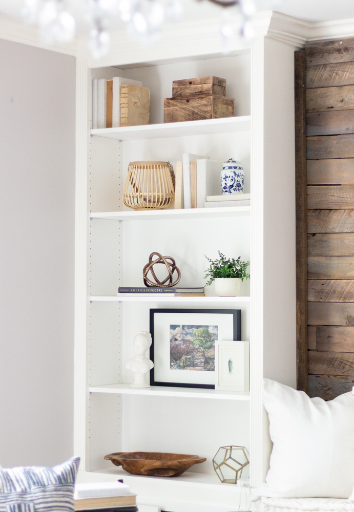
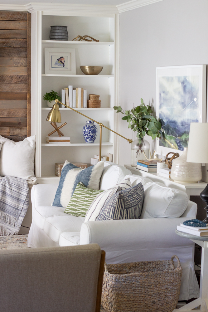
The black framed art on the shelf above is a small print of a painting my grandpa did in his early years, and my mom gave to me when I visited her earlier this year. I styled it in my bookcases a little differently– being more careful with the size, shape, and texture of the objects, giving them each space to ‘breathe’.
Growing up I created art on a regular basis– it was often what I was known for. As an artist however, I’m not in the group that believes they can ‘do it all’ and copy art they see that looks “easy”. I appreciate the inspiration, the time, method, education, and materials that go into creating art and I find value in supporting other artists. So this year I wanted to invest in some art that had meaning. I saw a painting on Minted with a color palette that is timeless and can be incorporated year around (grays, blues and greens), but also reminded me of where I grew up, in Southeast Alaska. I love that Minted allows you to choose the colors and medium you want, and it filters the art according to your wishes.
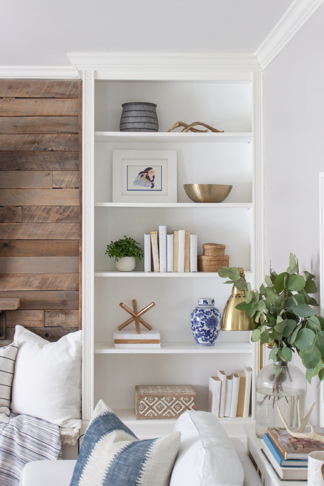
The white framed art on the second shelf is “The Embrace” by Rie Munoz, whose art is iconic is Alaska and is something I recently brought home from my trip.
One painting stood out to me because, besides being the right colors, the setting was in Ireland, where my family lineage traces. My namesake and great great grandma, Rachel Rebecca McGranahan was born in Ireland and immigrated to the United States with her parents and older brother when she was a small child. It makes me smile to have a beautiful painting in my home that reminds me of the sacrifices my ancestors made to help create who I am today.
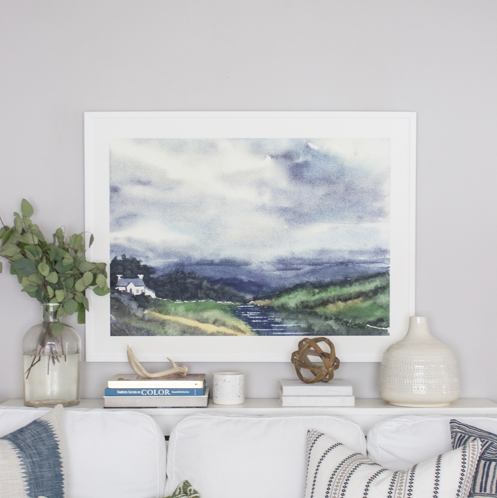
The painting is called “Cloud Symphony Donegal Ireland” by Eva Marion.
Develop a Plan
By creating a design plan beforehand, you can eliminate frustration and wasted money spent from trying to put together the room with the ‘guess and check method’. Instead, you can ‘try on’ pieces digitally (I like to use Photoshop or Olioboard.com — you can import your own objects). Creating a design plan will save you time in the long run, and allow you to mix together colors, patterns, and textures, so you can see what element needs to be repeated to achieve balance.

Because I already have furniture and lighting I love (the two other things in I room I feel are worth a splurge), I mainly wanted to see what colors, patterns and textures I could bring in that would work with my newly selected painting. The above is my inspiration board I created months ago.
Part of developing a plan is getting samples whenever possible (if shopping online). Whether it’s upholstery or pillows, it allows you to see the colors and how they work together, feel the texture, and compare quality in person with the fabrics/textiles you are interested in.
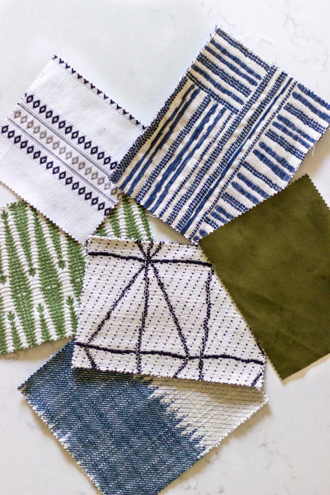
Many of the pillows I fell in love with were from Tonic Living. I first bought fabric from Tonic last year when I made new curtains for my daughter’s room. Then I ordered some of their pillows for one of the photoshoots I did with BHG last fall as well. Even though I had to return those pillows, I had already fallen in love with the quality and style. For that reason, I chose to partner with Tonic Living to get new timeless pillows for my living room. Happily, they offer samples of all their fabric, including their stock pillows! They also offer much more than pillows– drapery, ottomans, custom work, and fabric by the yard.
Choose a Variety of Texture and Pattern
Selecting pillows, throws, and decor that offer a variety of texture and pattern makes the room interesting and a place that they eye wants to follow across the room. Velvet, ribbed, nubby, woven, shiny, fuzzy or furry, metallic, matte, bumpy, smooth, are all textures you can incorporate. It’s best if you have different textures next to each other, so they don’t try to compete with one another. I like to mix pattern by having one bolder pattern, a couple solids, and then a couple smaller patterns that have one predominate color. The smaller patterns read as a single color with texture from afar, but are more interesting than a solid.
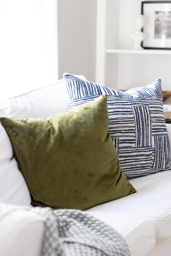
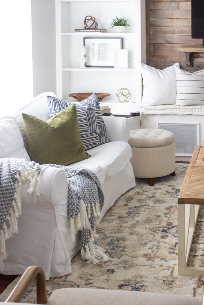
Pictured above is the Ritz Velvet, Fern pillow (feels very luxurious), and the Quinn, Indigo pillow. I got 2 of those Quinn pillows for each sofa.
This denim blue and cream stripe one (Passagio, Batik) is of my very favorites and was out of stock most of the summer as it’s one of their most popular. I was thrilled when it came back in stock, and am currently thinking of getting the long lumbar one for my bedroom!
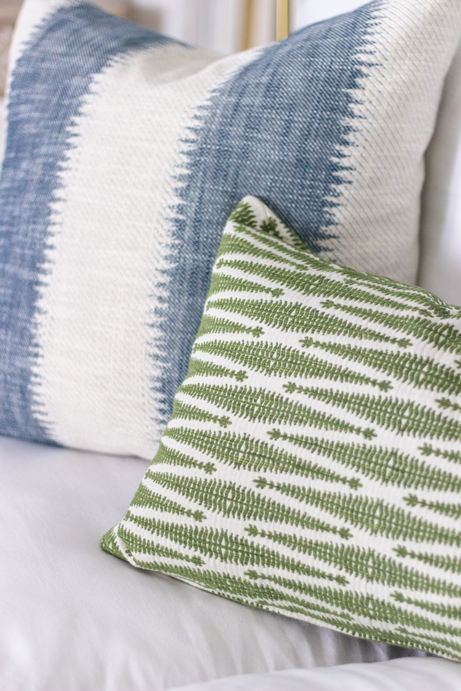
I find it so hard to find a good green pattern pillow, as often the color is not quite right or the pattern is too bold. I was so happy to find the Ingrid, Moss lumbar pillow with the perfect color and textural and not too modern pattern! Even though they will be discontinuing this pillow soon, the fabric will still be available and custom pillows are their specialty (and affordable)! All the pillows have a zipper closure (in case you need to wash them which makes them so practical), and the insert that came with the lumbar pillows are very high quality faux down.
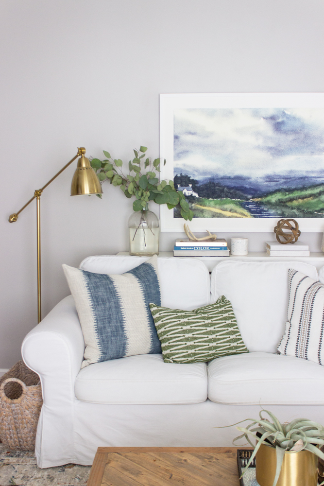
I love this view more than I can express. A good rule of thumb when hanging large art above a sofa is to go about 6 inches above the top of the back cushion or sofa table. You also want the size to be smaller than the length of the sofa, at least 1 foot from each end of the sofa.
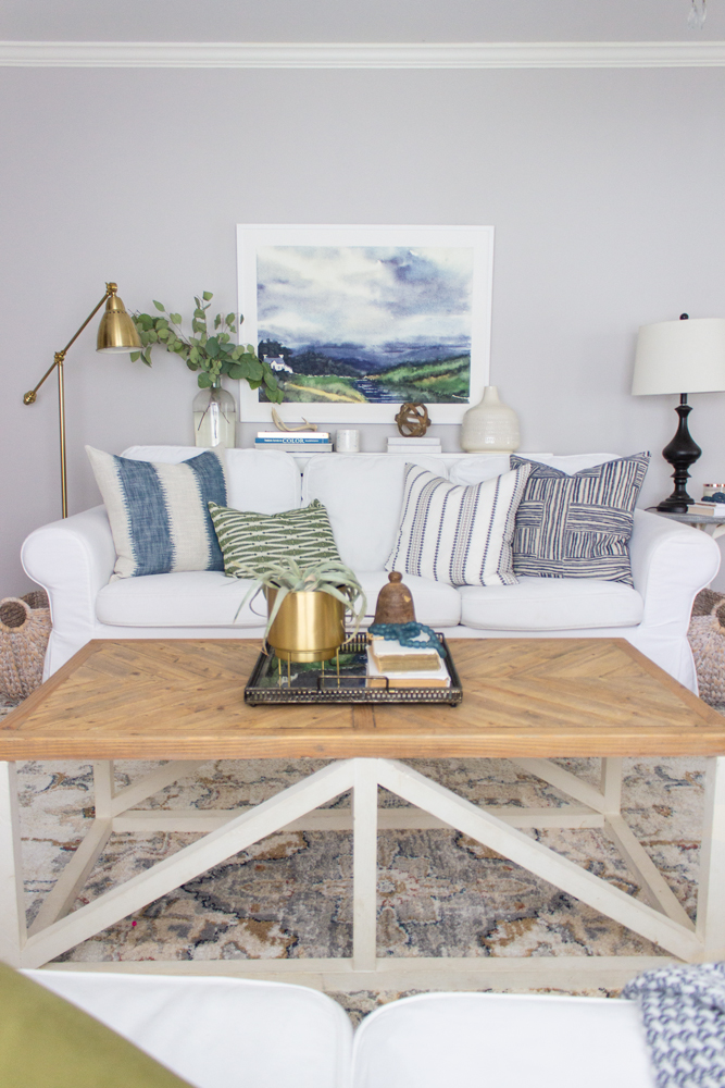
For the sofa table styling, I literally went onto Pinterest, typed in “console styling” and started studying the ones I liked the most that had large art above them. I wasn’t looking to copy them but more to see what type of objects where and the general shape of the styling. Then I looked around my house and moved things around and this is what I came up with. The large clear vase and the white pottery aren’t symmetrical but they balance each other out, and the smaller stacked books and things make it interesting without obstructing the view of the art.
I’ve also been searching for the right lumbar pillow for these two wood armchairs I bought earlier this year (another item I splurged on), since they are so deep, they are uncomfortable without a pillow. I originally wanted the Toulouse, Onyx lumbar pillows, but Janine, the owner of Tonic Living, suggested I get these Vigo, Cream lumbars instead since their size is better. Always important to measure pillow sizes to make sure they work in your space!

Our little 10 week old Standard Poodle, Rio, is sleeping under the chairs– his favorite spot!
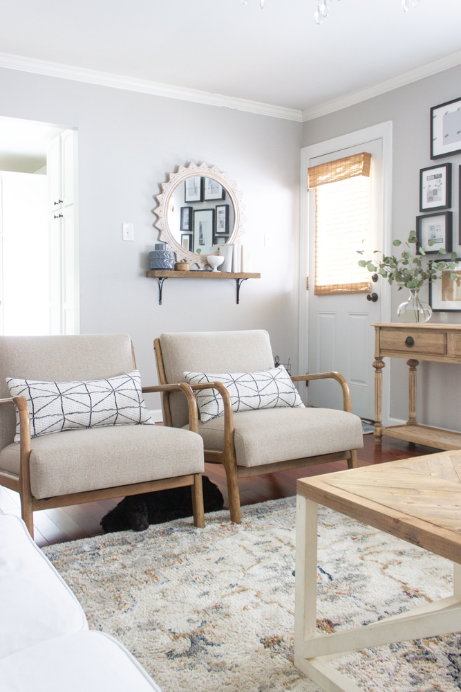
I don’t often share this view but I have made a few changes that are unfinished but still beautiful! Frames need pictures which I’m working on! The rug was a HomeGoods find earlier this year but I found on Wayfair. I was going to switch out the rug for something that was just blue, white, and gray, but it turns out I like the creams and brown in this rug– it will look great with the fall decor I have coming next week!
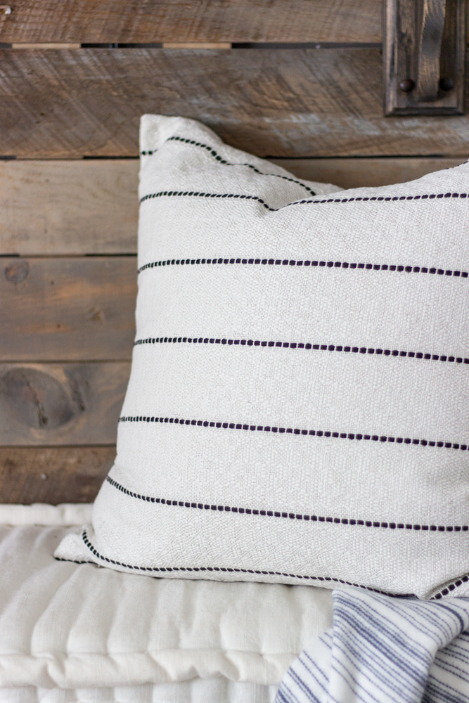
This Toulouse, Onyx square pillow is definitely one of those timeless pillows that will work with whatever color you want to put next to it, that is why I got two. The texture is soft but interesting, the simple skinny black stripe on an off-white background is so versatile, and the price is quite affordable for such a high quality fabric.
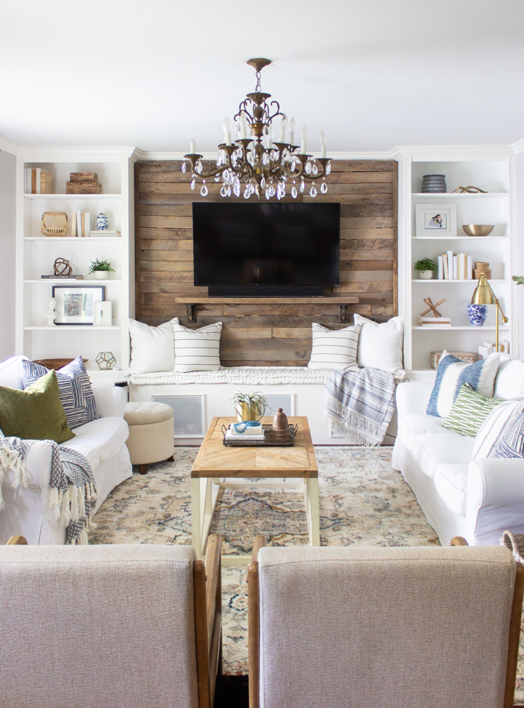
Timeless coffee table styling includes: a candle, a sculptural object, greenery (an airplane is great because it doesn’t often need watering), and some stacked books with something textural on top. Use colors and finishes that are repeated in the room and corral them onto a tray that is a different finish the the coffee table.

I hoped your enjoyed my tips for adding timeless color and texture to a space. Do you like these simpler changes to our living room?

Sources
Pillows on large sofa: Passagio, Batik; Ingrid, Moss; Boho Stripe, White; Quinn, Indigo;
Pillows on small sofa: Quinn, Indigo; Ritz Velvet, Fern
Pillows on bench: Toulouse, Onyx
Pillows on chairs: Vigo, Cream
Blue & White Throw on bench: HomeGoods
Blue & White Throw on couch: Target
Art: Minted
Brass floor lamp: Ikea
Round starburst mirror: World Market (old)
Black and white frames: Ikea
Large Clear vase on sofa table with greenery: World Market
Clear vase on console table under frames: Target
Chairs – Overstock
Coffee table – DIY
Ottoman – Target
Baskets on side of sofa – HomeGoods
Plant stand and basket – Ikea
Round end table – DIY
Area Rug – HomeGoods or Bed,Bath&Beyond
Chandelier – Craigslist
Built-in styling objects: HomeGoods, thrifted, Target, World Market
Coffee table styling: Brass planter- World Market; Blue glass beads – flea market, similar here; Wooden object – antique fair, candle – Joann
Built-ins- DIY
Bench – DIY
Pallet Wall – DIY
Beautiful and inspirational! Thank you!
So pretty! Thanks for the tips! Wondering if you’ll bring in any fall accessories like golds or oranges. It would look lovely with the blue!
Yes, I plan on it!! And those exact colors too! Thanks for stopping by Mary Ann!
Looks beautiful Rachel!
Rachel, did you build the console table behind your sofa? I am having a hard time finding one that tall, which makes me think I should just try to make one.
Yes I did! Super unglamorous and super simple– just some 2x2s for the legs (and leg support) and a 1×10 for the top.