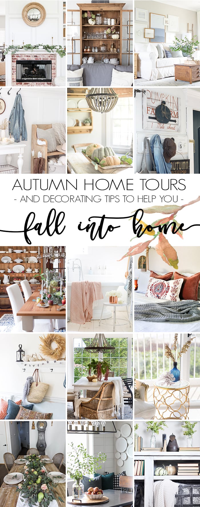
Hello all! Welcome to my home! Today is the Fall Into Home Tour and if you are popping over from A Burst of Beautiful, welcome! Alicia always has gorgeous photography in her light and bright home. I am going to give you a little tour around the main living areas in my home, decorated for this lovely season of autumn. The areas that I’m going to share are my entryway, formal front room, kitchen, dining room, and living/family room. I’m also going to be sharing 5 ways to incorporate vibrant seasonal colors in fall decor.
If you are new to my blog, allow me to introduce myself. My name is Rachel, I live with my family (Brazilian husband, 2 boys and 1 girl) in the suburbs of St Louis. We bought our brick ranch 3 1/2 years ago and we’ve been slowly but surely giving each room a makeover. My style is a mixture of farmhouse, craftsman, and modern. I am passionate about creating spaces that look collected, not cookie-cutter and that is what I strive to inspire through this blog!
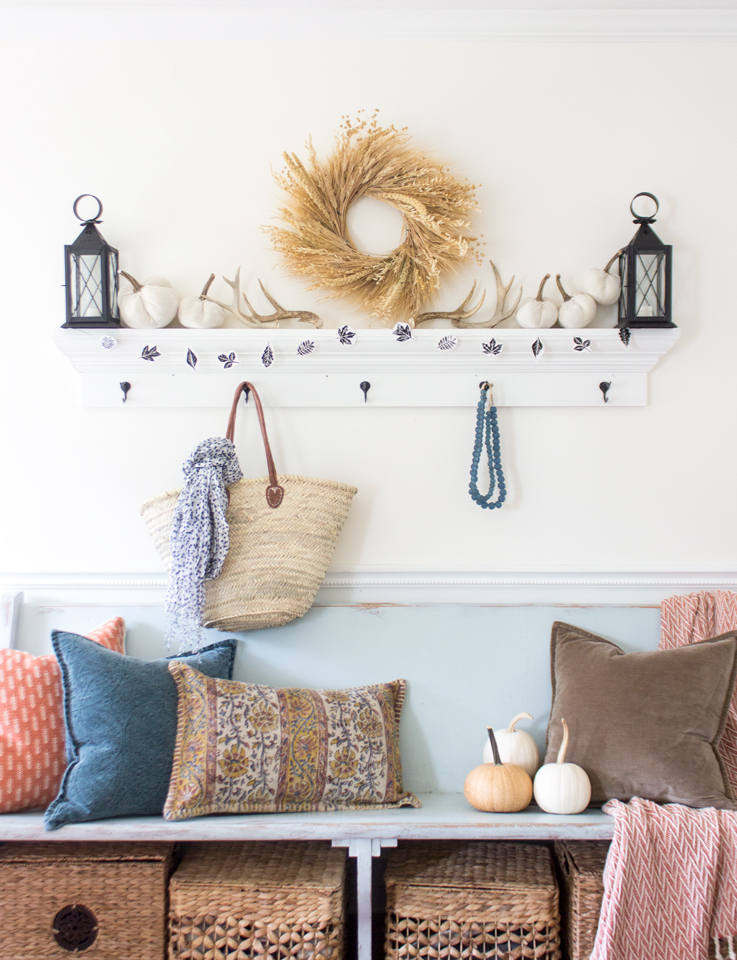
This is my entry way… there isn’t much space for a designating entry, so I took one wall of our formal front room, and put a thrifted 6′ church pew (that I painted) and hung a shelf with hooks (that I built) above it. It’s perfect for our family’s needs!
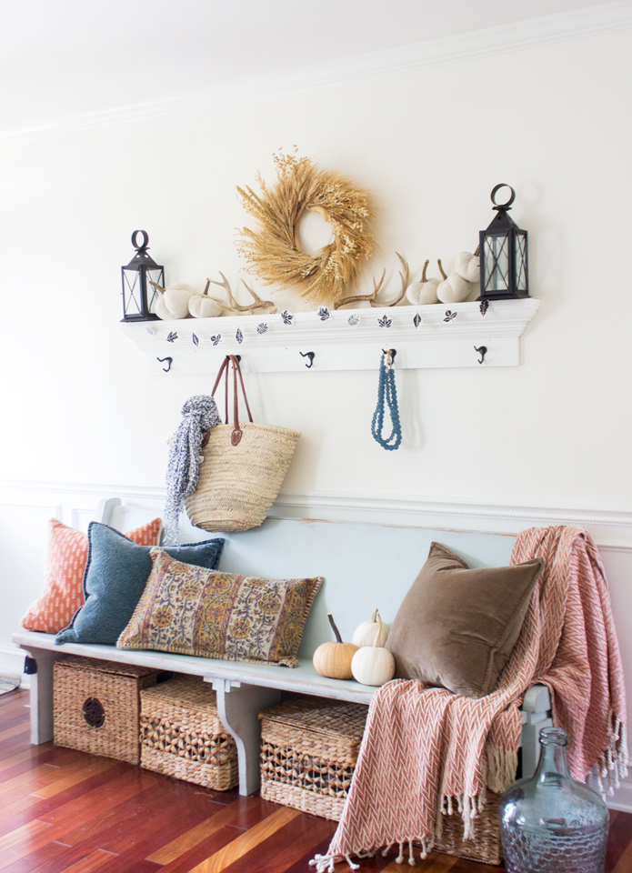
Last Friday I shared 2 different ways to style an entry, and this traditional color scheme is the one that I kept.

I also used these sweet little leaf garland from the block printed leaves that I made as a free printable last week!
To shop this space, look here:

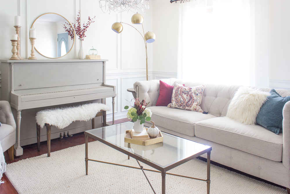
Next up, is my formal front room. This is the first area you see (besides our entry) when you walk into our home. It’s not a huge room, but it is pretty and inviting. I always strive to make my home look put-together and stylish, but also relate-able and comfortable.
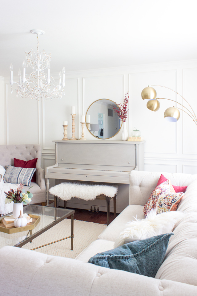
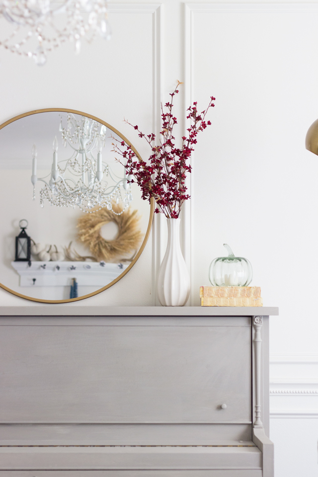
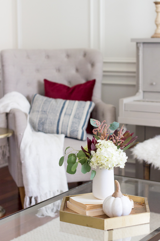
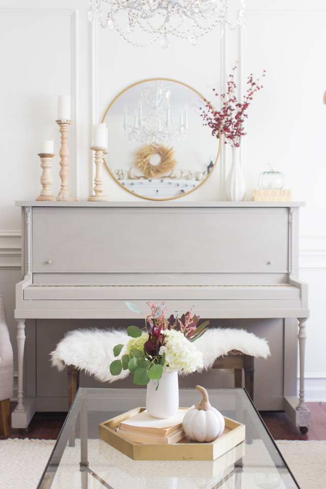
I like to mix things up and do something a tiny bit unexpected now and again so that photographing a space doesn’t get boring for me. If I take pictures of a room for a few seasons in a row and the main components haven’t changed or moved, then I get bored and don’t love the end result. So… I moved the mirror to be above the piano, took out most of the blue and white, and added some some pops of color (burgandy/cranberry) that I normally don’t use in my home but were a welcome and vibrant change.
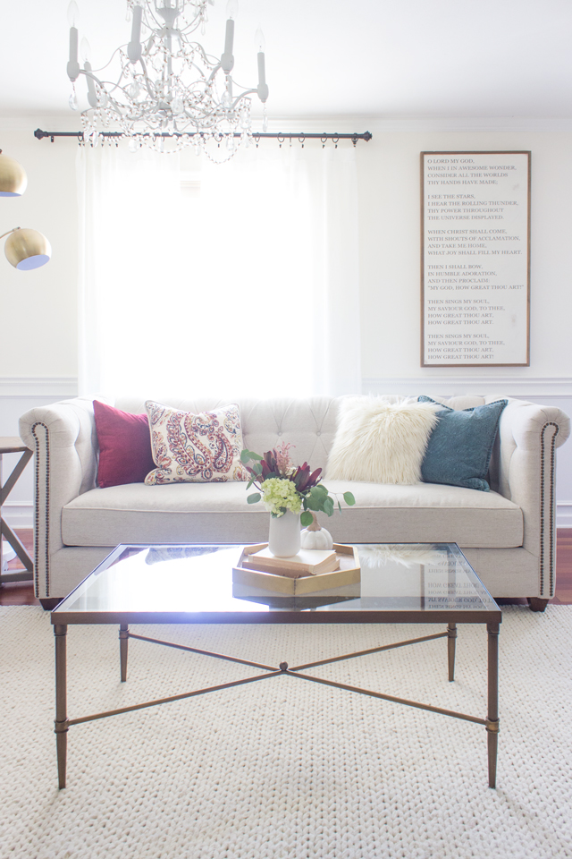
I really am loving these colors in this room that has a base of mostly whites/creams.
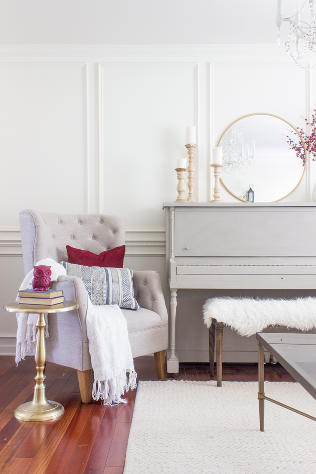
Note: never underestimate the power that simple wall molding and wainscoting can have on a room. It instantly adds texture, classic sophistication, and the appearance of higher ceilings.
Most bloggers and designers tend to gravitate toward very neutral seasonal decor which is pretty timeless and always beautiful. I have done that and I personally missed seeing the vibrant and rich colors of autumn inside my home. That is a big reason I decided to embrace those colors and incorporate them into my decor this year. So, if you are like me and want to get all festive but don’t want to make the mistake of making your house look like fall threw up all over your house (haha kidding!!) , then here are some no-fail tips:
How to Incorporate Vibrant Seasonal Colors in Fall Decor
- Remove ALL color that isn’t very neutral. Leave tones of gray, white, cream, beige, wood tones, natural seagrass, etc. This gives you a sort of ‘blank slate’ to start with.
- Select 1-2 bold seasonal colors that pair well with your current go-to colors. In my front room, my go-to is a teal-blue color. So I selected a shade of red (burgundy/cranberry in this case) that still said ‘fall’ but also when it sits next to that teal-blue it looks pretty but not too childish. If I added a secondary color it would probably be in the same family as that cranberry color, so as to not compete with it too much, but a lighter shade– so maybe like a mauvy-pink or light orange. You typically don’t want more than 1 dark and dominant color.
- Repeat that bold seasonal color 3 times when looking from a specific angle. That means if I’m standing from my kitchen/hallway looking into the front room, I should could see that burgundy/cranberry color repeated 3 times in the room, and spaced out a bit– I don’t want them all in the same corner. Give them a little breathing room so they each can catch your eye and make you look a bit longer. When I look from my dining room behind that gray tufted chair, I don’t see the cranberry pillow sitting there, but I *do* see the branches on the piano and the cranberry pillow on the sofa. So I want to repeat that pop of color one more time– like a scarf hanging over the arm of the couch or hanging on a hook, or a throw blanket on my entry bench.
- Layer lighter colors on top of the darker, more vibrant colors so that they don’t ‘steal the show’. You don’t want to obscure them completely, but obscure them just a little. Most of the time people don’t notice how much a dark color can create a sort of ‘black hole’ that always catches your eye and makes you ignore other pretty details in the room… but as someone who photographs my home a lot (and who learned a lot from the photographer from Meredith), you see these ‘black holes’ easier behind the lens of a camera.
- When using bold patterns with a couple bold seasonal colors, consider not letting it compete with another pattern in the room. You normally don’t want to have more than 1 ‘busy’ pattern in the room. Smaller patterns are okay because from far away they look more like a solid color with texture… Some of this requires pulling out all your options and start putting things next to each-other and seeing what looks good together. You will learn that two different floral/paisley patterns don’t look good together, but maybe a check, stripe, or polka-dot with a floral looks great. Too much texture next to each other also tends to look ‘busy’. Space out that fur or knit texture with a smooth solid color or a smooth pattern fabric, or really anything that shows variety.
Shop the room here:
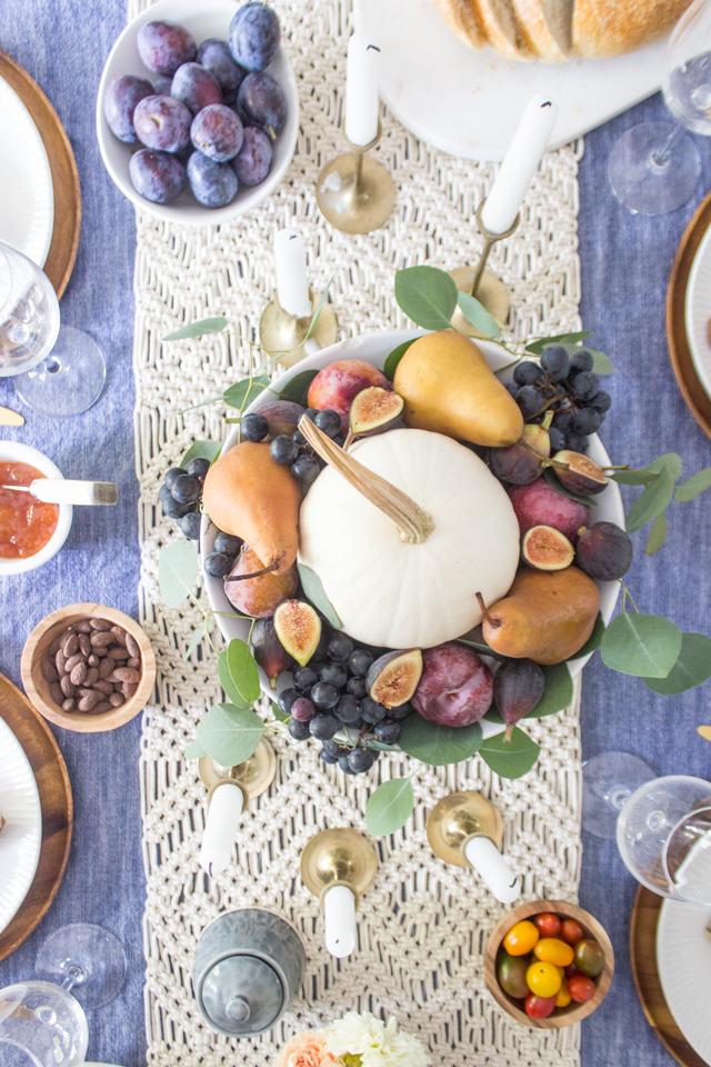
After leaving my front room, you walk into my dining room! It really is more of an eat-in kitchen than a designated dining room, but you make do with what you have in a small house! This dining is all decked out with a fall tablescape that I created last week.

To see more of this fall fruit centerpiece and tablescape go here.
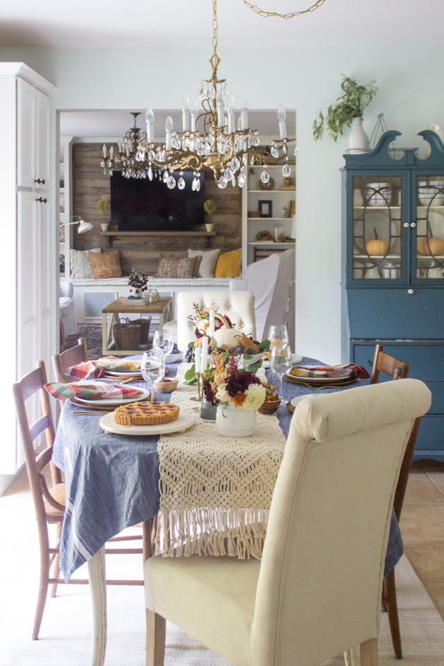
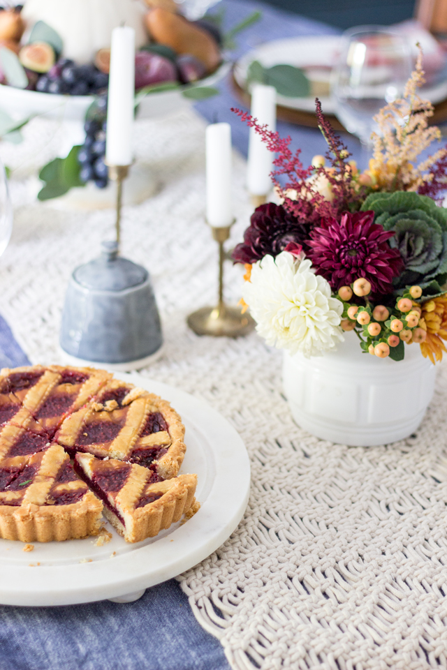
I can’t get enough of that centerpiece– all real and fresh fruits surrounding that pumpkin!!
If you saw my home last fall, you may have noticed I re-oriented my dining table the other direction. That is because I re-oriented my kitchen island!
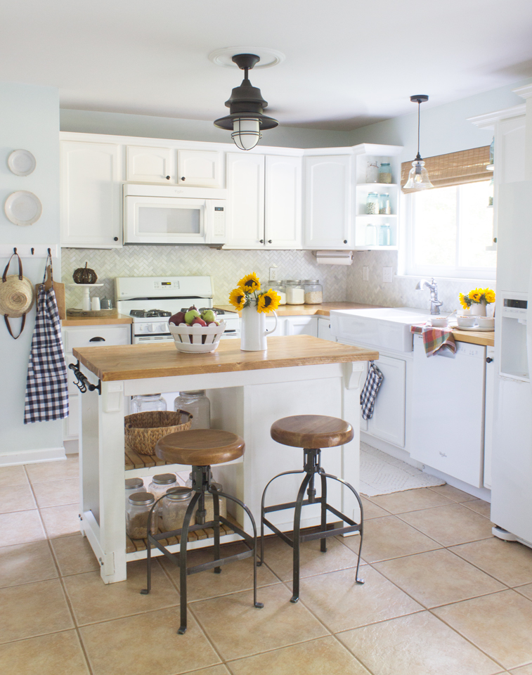
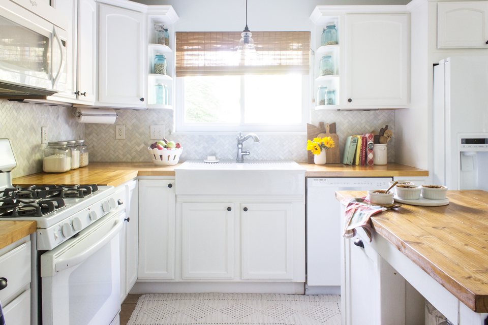
It’s been almost 2 years with our Ikea farmhouse sink and I have not seen a single scratch or stain on it yet! I give it 5 stars!
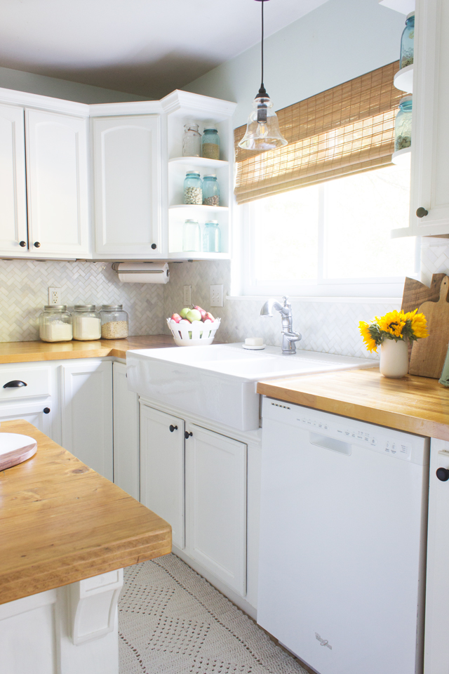
I’m so thankful our kitchen is bright and reflective because as the amount of light diminishes in the fall/winter, this room still stays cheerful. To see more of this kitchen, check out my fall kitchen tour here.
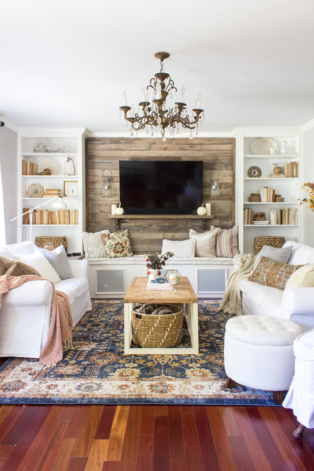
Finally, on to our living/family room. The main thing I switched out in this room for fall is the rug. It COMPLETELY changed the feel of the entire room. So much cozier! And I LOVE the colors of fall that are in this rug! We have had a mostly white and navy trellis rug in there for about 3 years, and I was ready for something different. This darker colored traditional rug was just what I was craving.

Also I tried to simplify the accent pillows and throws since the rug was much busier and colorful, so I stuck with mostly solid colors and textures in neutral but decidedly soft fall colors.
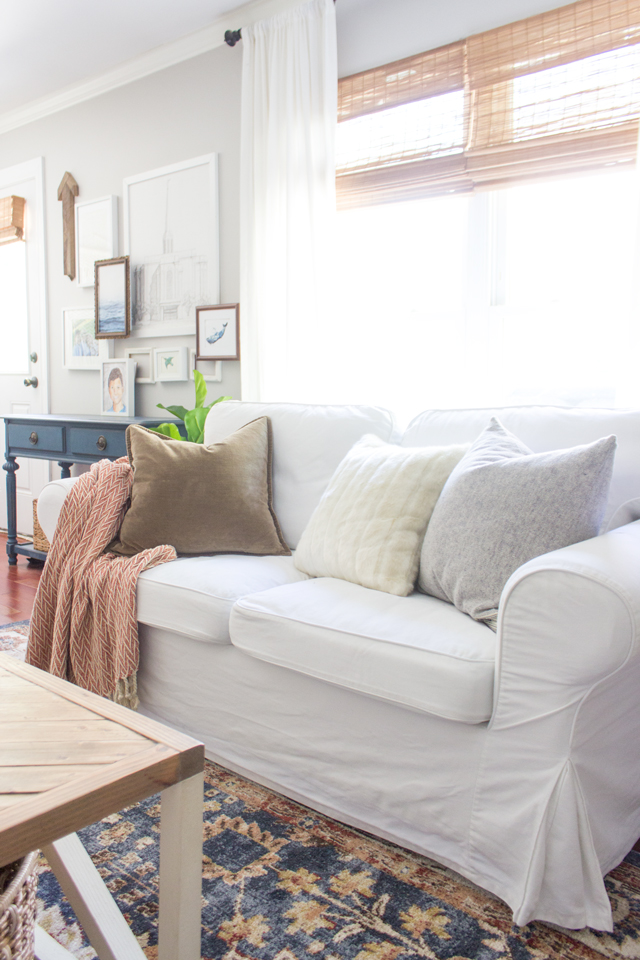
I know this look is a lot more “hushed” (as Layla would put it), than my usual living room decor, but this more tone-on-tone look draws attention to the textures more.

I’ll be sharing more of this living room for the 3rd week in the Seasons of Home Series, but I’ll leave you with my favorite view:
To shop this space go here:
Now I would LOVE if you would hop over and visit my friend, Annie from Zevy Joy’s home decorated for fall! She is a master at mixing beautiful textures and creating stunning vignettes!
Monday Tours
 Maison de Pax | Nina Hendrick Design | A Burst of Beautiful | Shades of Blue Interiors | Zevy Joy
Tuesday Tours
 Tidbits | Cherished Bliss | So Much Better With Age | AKA Design | ShabbyFufu
Wednesday Tours
 Bless’er House | Finding Silver Pennies | The Wicker House | Love Grows Wild | The Wood Grain Cottage
Rachel- your whole home is beautiful! I think you are so right, that wainscoating adds instant beauty and classic design. Thanks so much for joining the tour!
Looks great! Thanks for giving me some ideas for my blue house!
Everything is SO gorgeous, Rachel! Love all your fall elements.
Hugs, Jamie
LOVE all the vibrant shades and the rug in your living room. Everything is stunning. x
It’s gorgeous! I love your vibrant hues!!
OH my goodness, those final few shots of your living room are amazing! I love the colors, textures, and how warm and cozy it feels.
Love all of the colors and textures…pinning! Fun touring with you this week…Janet
And just like that, I’m craving some vibrant Fall colors in my life 😉
I’m not understanding how to work the shop widget. I copied and pasted it into my browser but it just took me back to your page. What am I doing wrong? I love the rug and the coral chevron throw and would love to know where you got them. Thank you!
What color is the piano and paint brand
It was a custom mix of Annie Sloan Chalk paint French Linen and pure white I believe.